Background
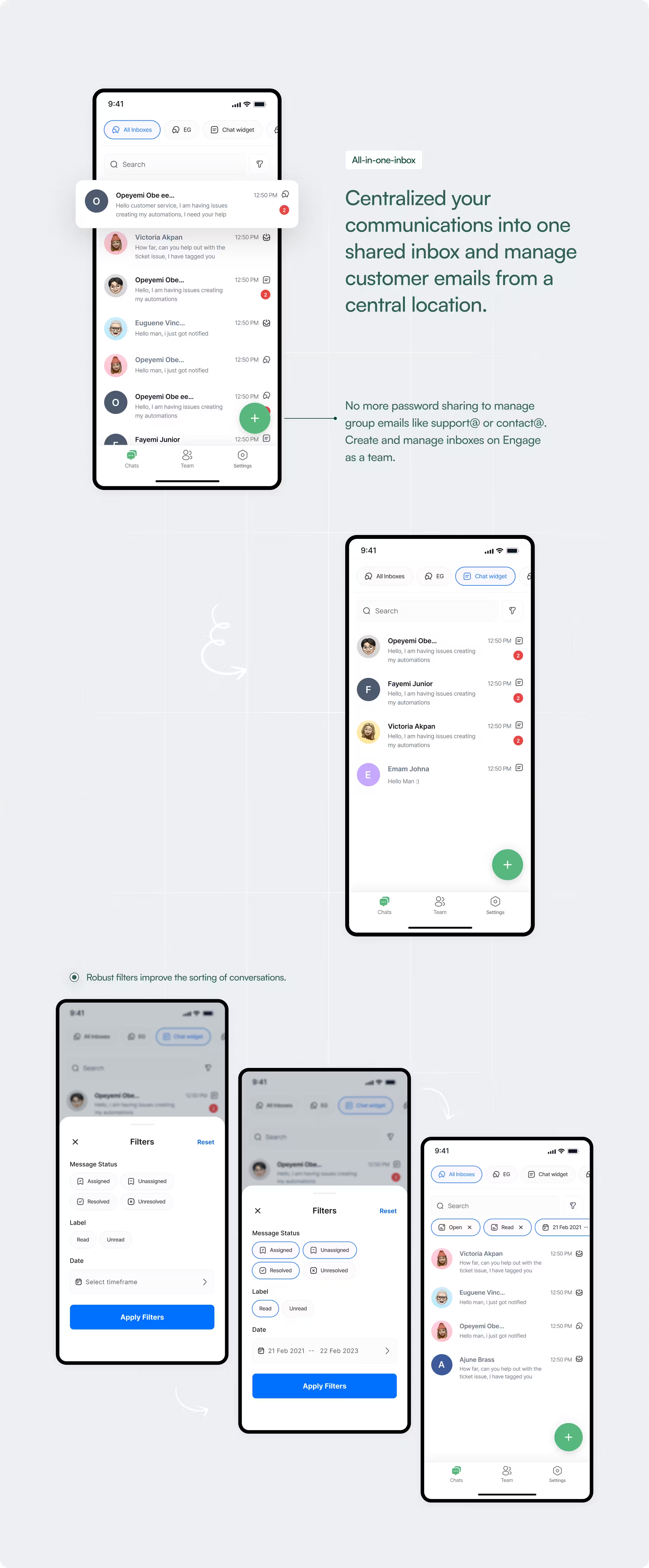
By 2022, Engage’s web inbox had matured into a robust system. Teams relied on it daily to:
Respond to customer messages
Track conversation status
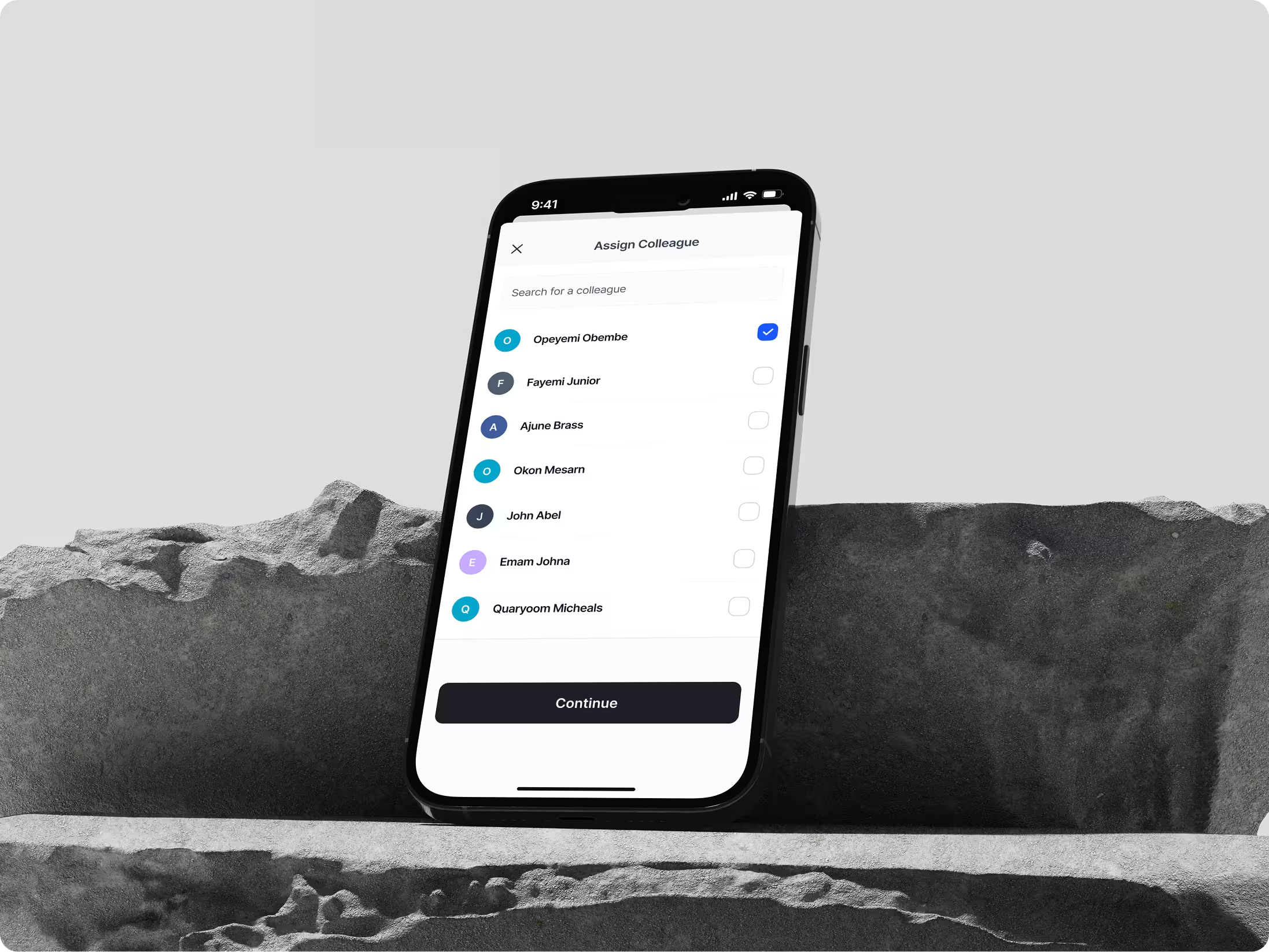
Assign responsibility across teammates
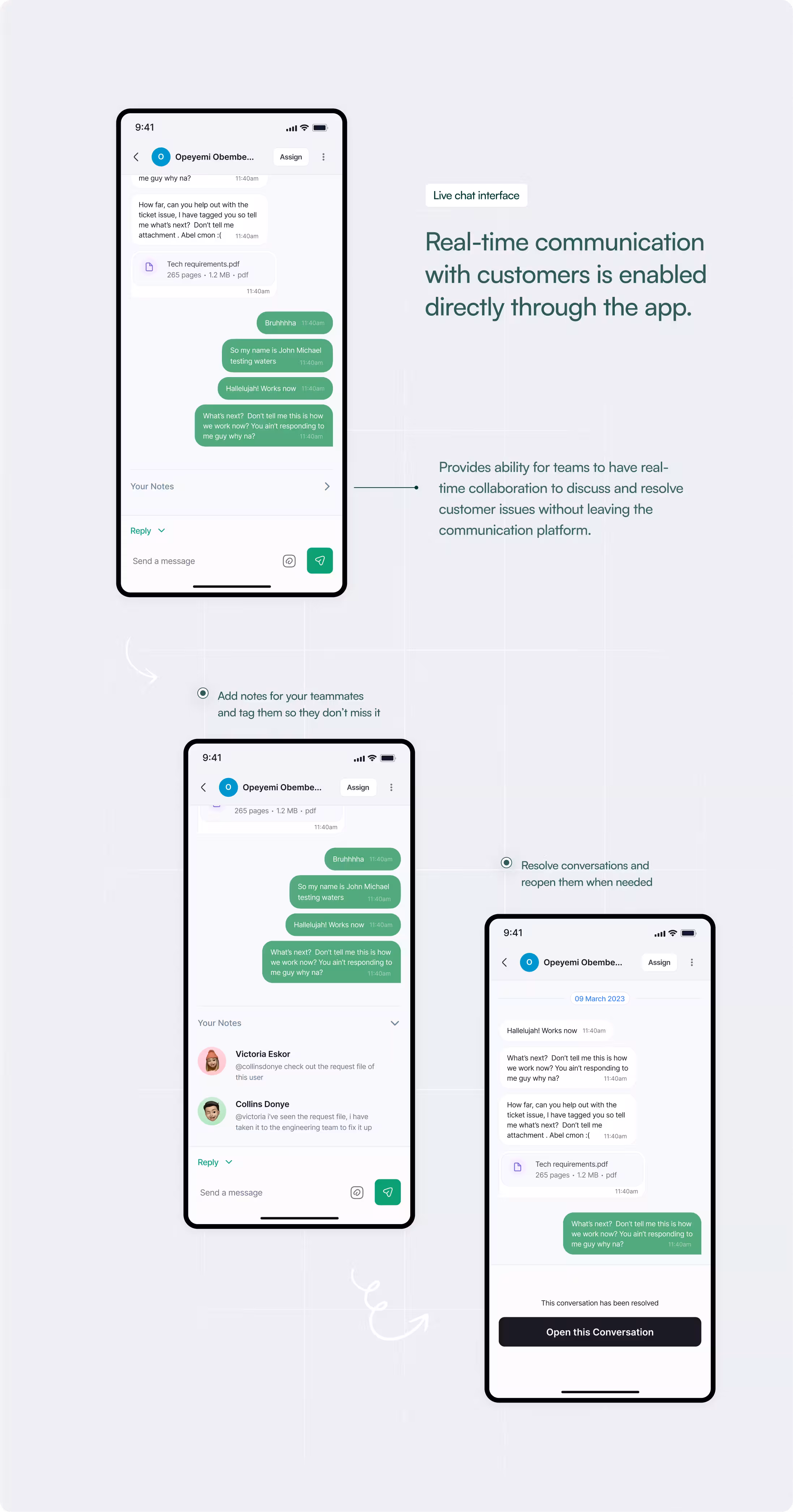
Coordinate internally through notes and mentions
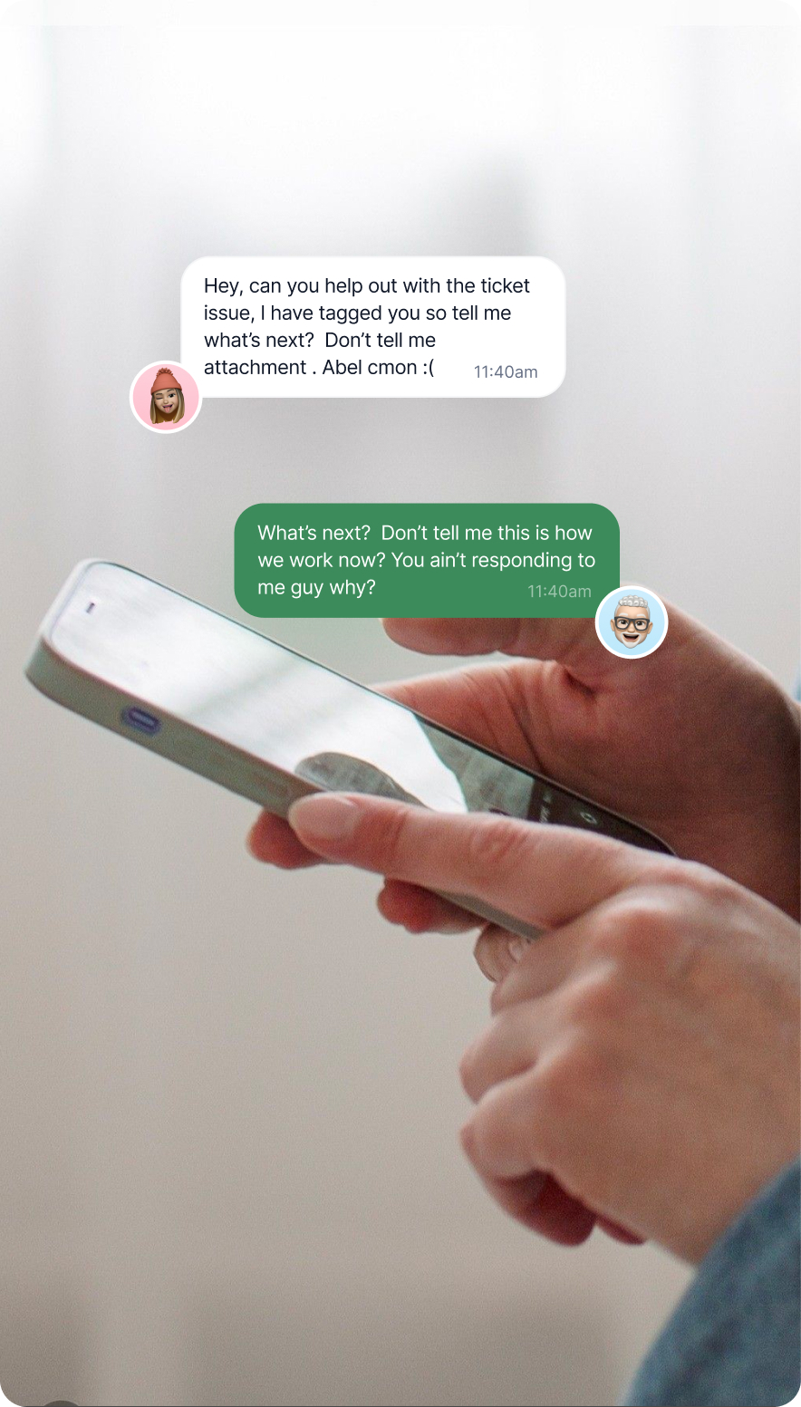
As usage increased, so did the need for responsiveness outside desktop environments. Managers and field teams were increasingly mobile. Delayed responses began to impact team velocity.
The mobile experience at the time did not reflect the speed or clarity teams expected. Mobile was no longer optional. It became a responsiveness surface.
The opportunity was clear: Bring full functional parity to mobile while simplifying interaction to suit a constrained interface.
The Core Tension
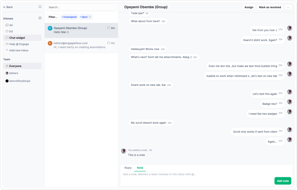
Given Engage already had a working web inbox. It handled a lot of complexity, threads, ownership, status tags, channel indicators, internal notes, all visible at once, and that worked on desktop.
You have room. You can scan. You can hold multiple layers of context on one screen without it feeling overwhelming.
On a smaller surface, the same density becomes friction. What felt efficient on web starts to feel crowded. What felt informative starts to feel noisy.
And the more you stack into one view, the harder it becomes to move quickly.
The risk wasn’t that the app would look bad. The risk was that it would technically “work” but feel heavy.
At the time of writing - the Inbox Web App Tool
Slower. More mentally demanding. Something teams would tolerate instead of prefer, and if mobile introduced friction, teams would avoid it. If it altered behaviour in anyway, their workflows would fracture. This was not a UI resizing exercise. It was a behavioural translation challenge.
And this misses the point entirely if we take this route. So instead of asking, “How do we fit this on a smaller screen?”I asked, “What does someone actually need in the first 3 seconds?”
That shift changed everything.
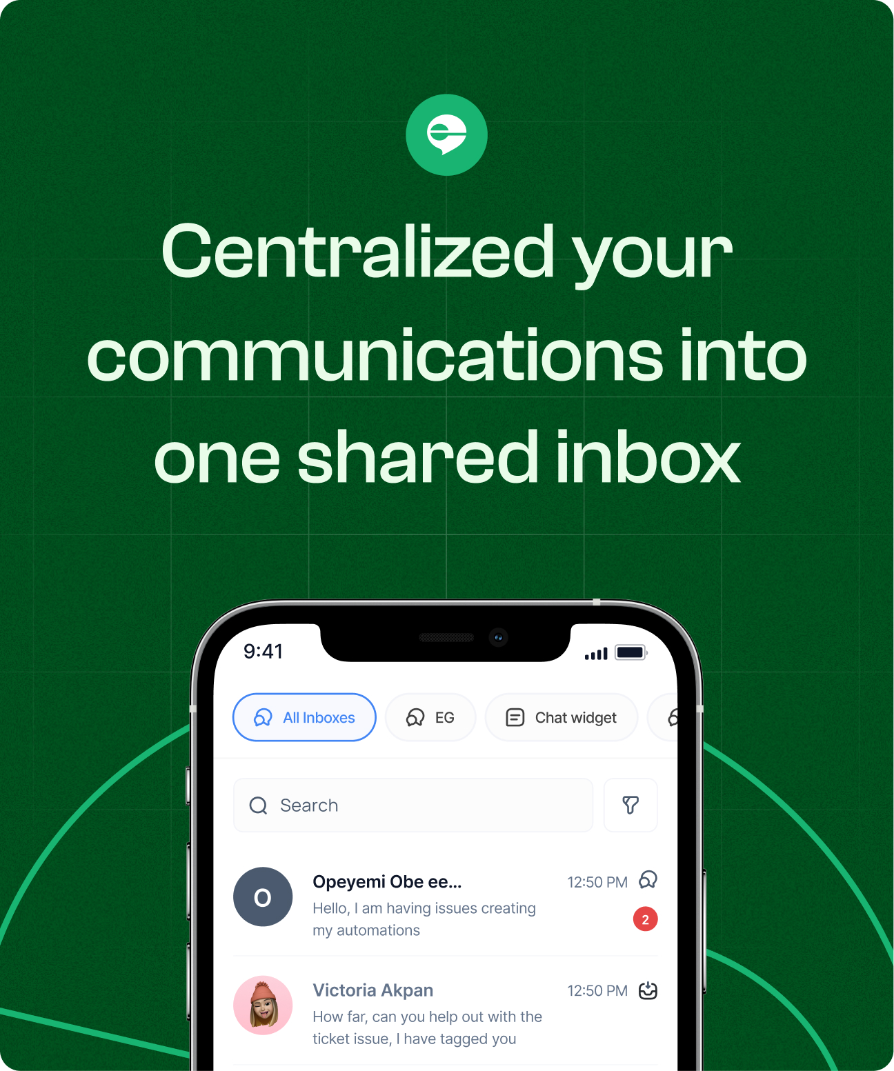
Outcome
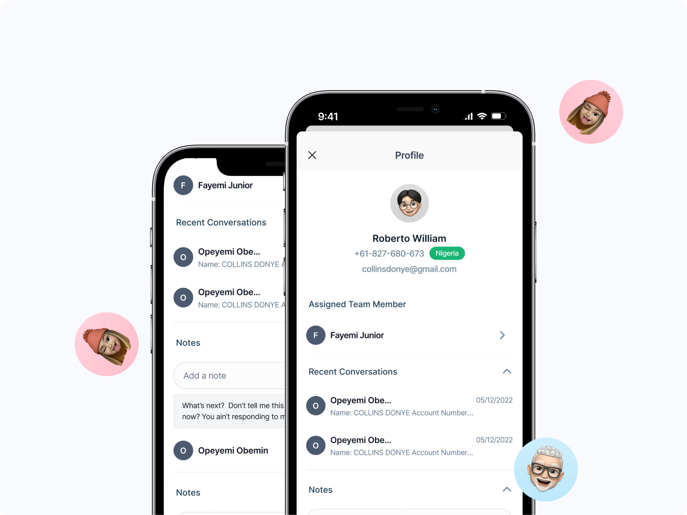
The mobile inbox became a natural extension of the web product. Mobile inbox adoption increased among managers and field teams. More importantly, the experience did not fragment behavior between surfaces.
Teams could:
Quickly scan and assign conversations
Resolve issues while away from desktop
Maintain ownership clarity across devices,
All confidently without switching mental models between web and mobile. This made the mobile feel like a natural extension of the workflow. Not a secondary interface.
That was a major success for us as a team and a validation for me as a designer who led this task.
.avif)
.avif)
.avif)
.png)