The Product & The Context
Idara helps founders across Africa register businesses, obtain licenses, and stay compliant with regulatory bodies. Unlike typical SaaS products, Idara sits directly in the path of legal and financial outcomes. If users get stuck, make mistakes, or lose documents, real-world consequences follow — rejected registrations, delayed approvals, and regulatory risk.
By the time this project began, Idara had strong traction with over 16,000 users and rapid growth. The business model was working. The product experience, however, was starting to show strain under real usage. What worked for early adopters began to break at scale.
As Idara expanded across countries and regulatory bodies, the platform needed to evolve from a set of forms into a dependable system founders could trust with legally sensitive workflows.
When the Product Becomes the Bottleneck (The Problem)
As more founders used Idara to navigate business registration, friction became visible in everyday usage. Founders weren’t just slowed down, they were uncertain. They didn’t know if they had submitted the right documents, whether someone was reviewing their application, or what would happen next.
The product experience created anxiety at the exact moments users needed reassurance. Instead of feeling guided through regulation, founders felt like they were navigating bureaucracy alone.
This friction surfaced in support tickets, drop-offs mid-registration, and repeated questions like:
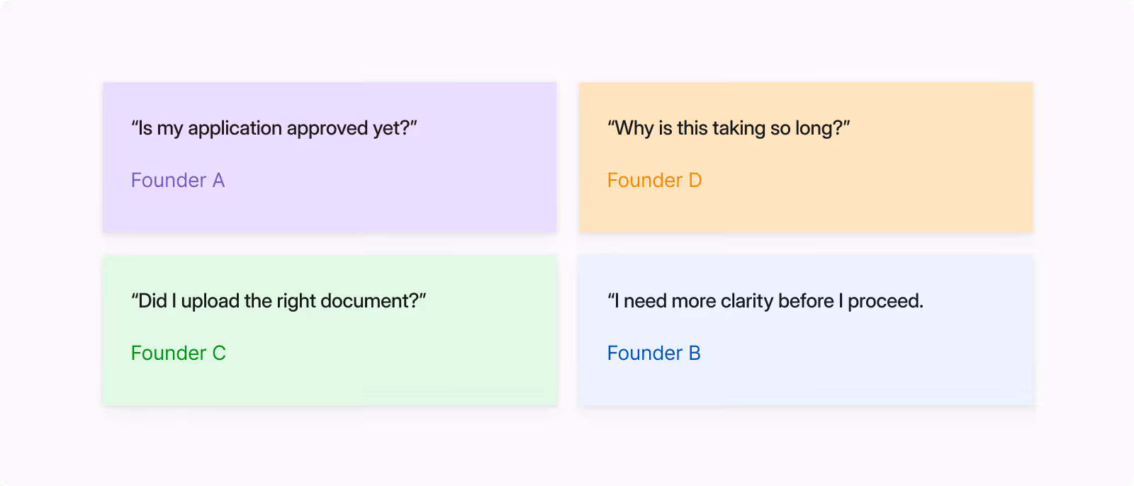
These patterns surfaced consistently across support tickets and sales calls.
Old B2B platform
The platform wasn’t failing technically, it was failing emotionally. Trust was eroding at the moments it mattered most.
Designing Inside Regulation (The Constraints)
This project operated inside a highly regulated environment, which fundamentally shaped what could be designed and shipped. Unlike consumer apps, flows couldn’t be simplified purely for UX convenience.
Every step had legal implications. Regulatory bodies required specific data formats and documents, compliance workflows needed audit trails, and backend systems were tightly coupled to government processes. This meant improvements had to be incremental, production-safe, and legally accurate — even when that conflicted with ideal UX patterns.
Constraints that shaped the work:
Regulatory bodies enforce strict submission formats
Compliance required traceable records and immutable history
Backend systems limited how far flows could be redesigned
This forced a design approach grounded in systems thinking: improving clarity without breaking compliance, and improving speed without creating legal risk.
Reframing the Problem
Initially, the product team framed the problem as “how do we make registration faster?”
Through user interviews and workflow mapping, it became clear that speed wasn’t the real blocker. Uncertainty was.
Founders weren’t frustrated by the number of steps — they were frustrated by not knowing where they were in the process, what was happening behind the scenes, and whether they were doing things correctly. Which begs the question...
How might we...make regulation understandable, predictable,
and trustworthy for first-time founders?
This reframing shifted the design goal from reducing steps to increasing confidence, visibility, error prevention and trust throughout the journey.
The Strategy
I anchored the redesign around three principles.
1. Visibility over speed
Users should always know what stage they’re in and who is responsible.
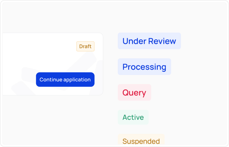
2. Guided compliance
Regulatory workflows should feel structured and assisted, not overwhelming.
.jpg)
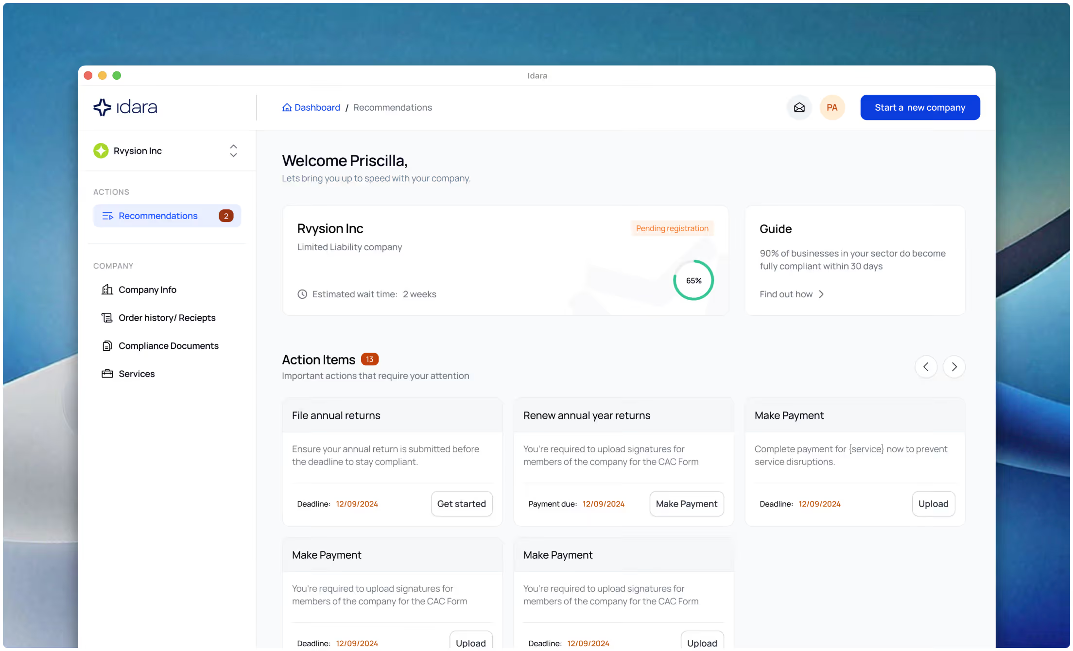
3. Long-term system of record
Idara had to evolve from a one-time registration tool into an ongoing compliance home.
.jpg)
These principles reframed Idara from a one-time service into an ongoing system of record for founders.
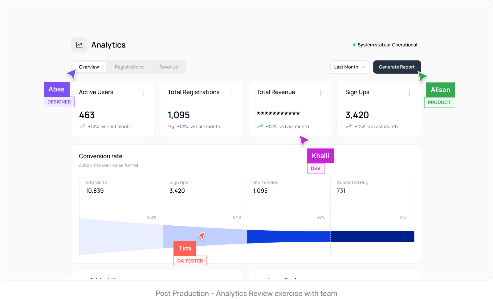
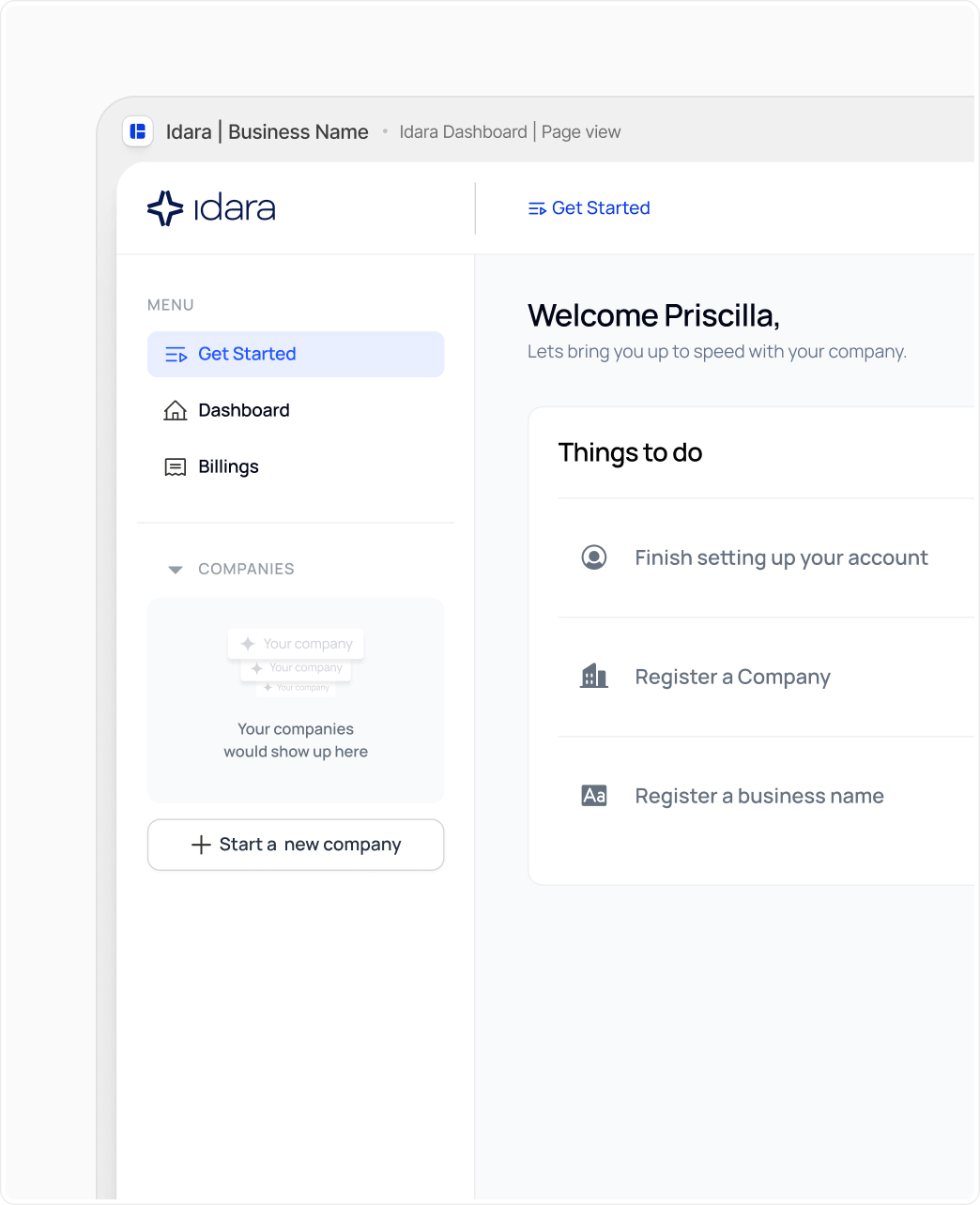
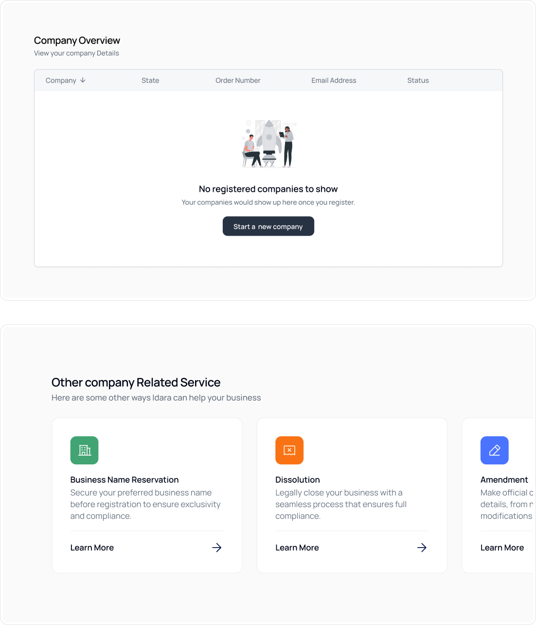
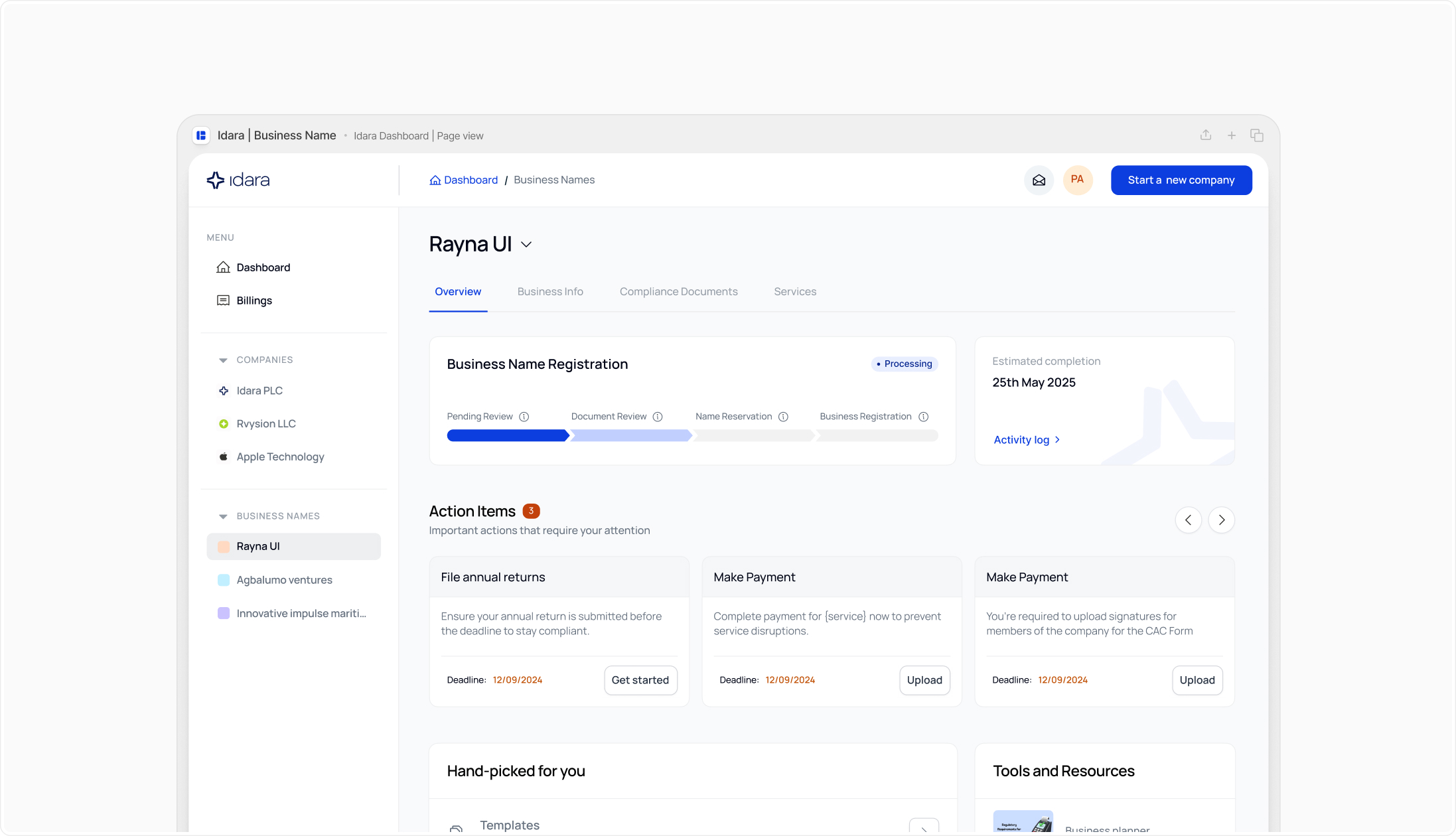
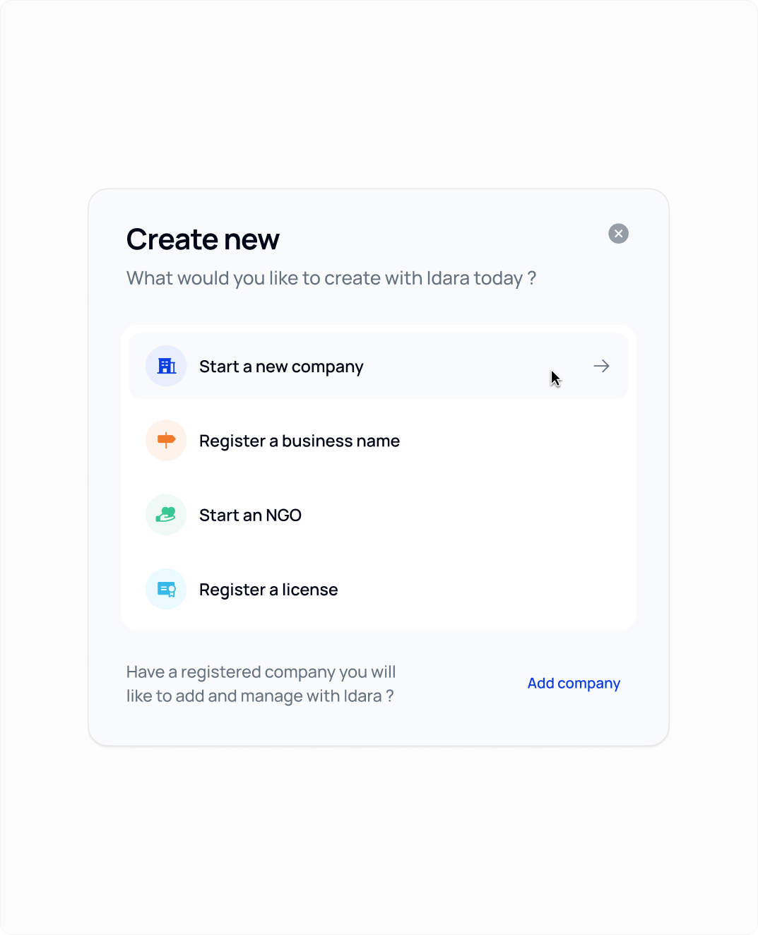
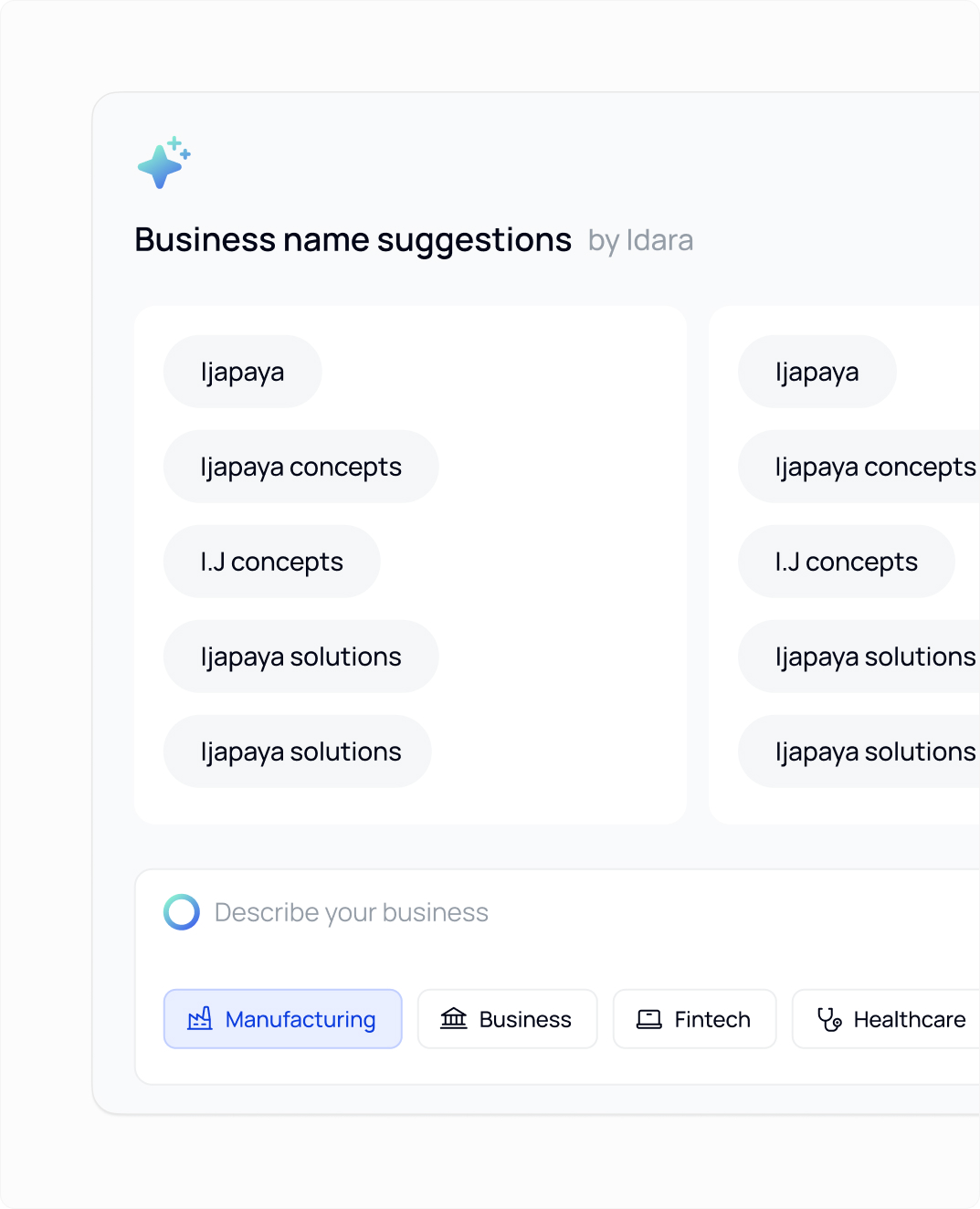
Rebuilding the Core Experience
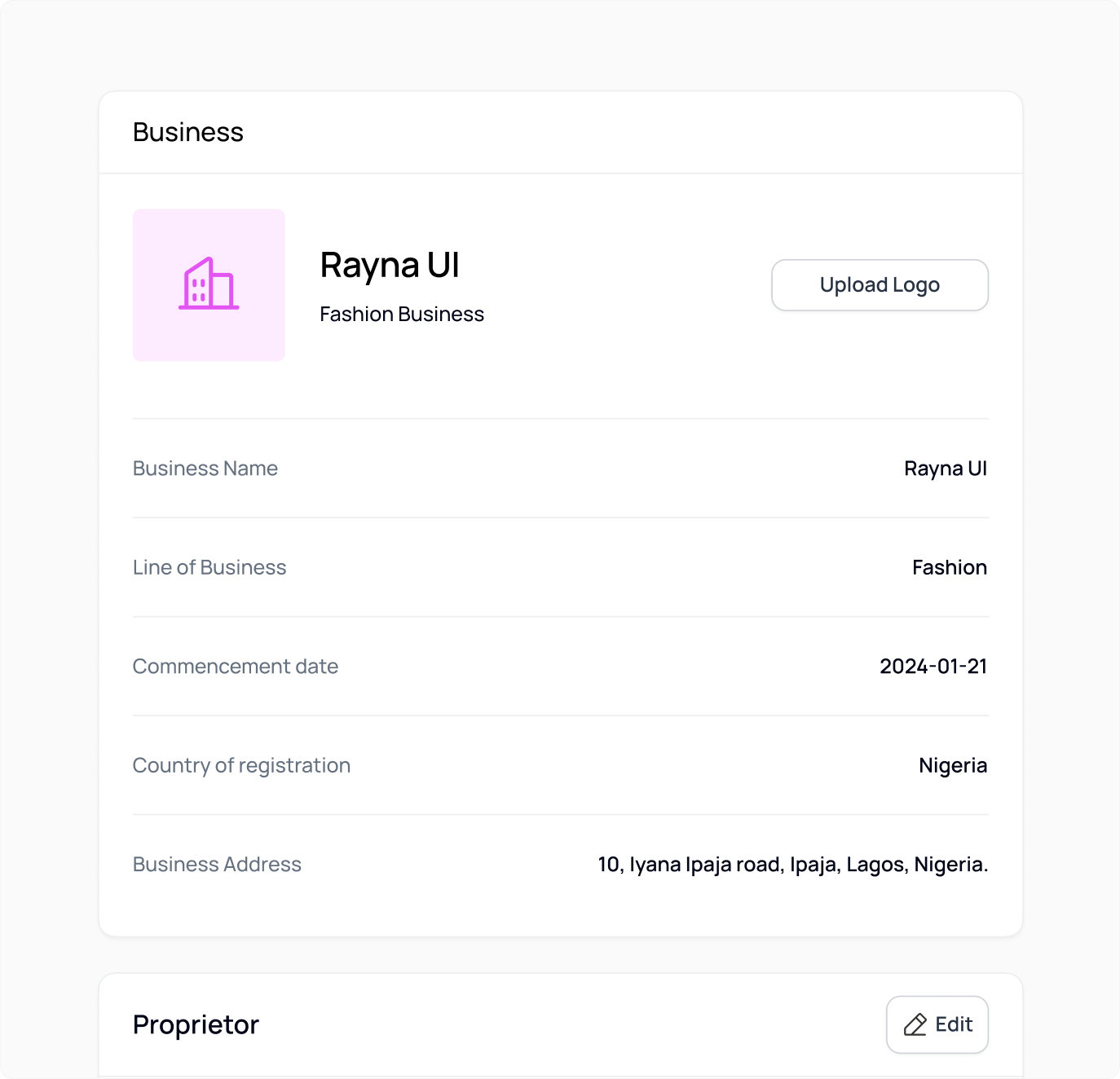
Rather than treating Idara as a collection of features, I redesigned the platform around how founders actually move through business setup and compliance over time.
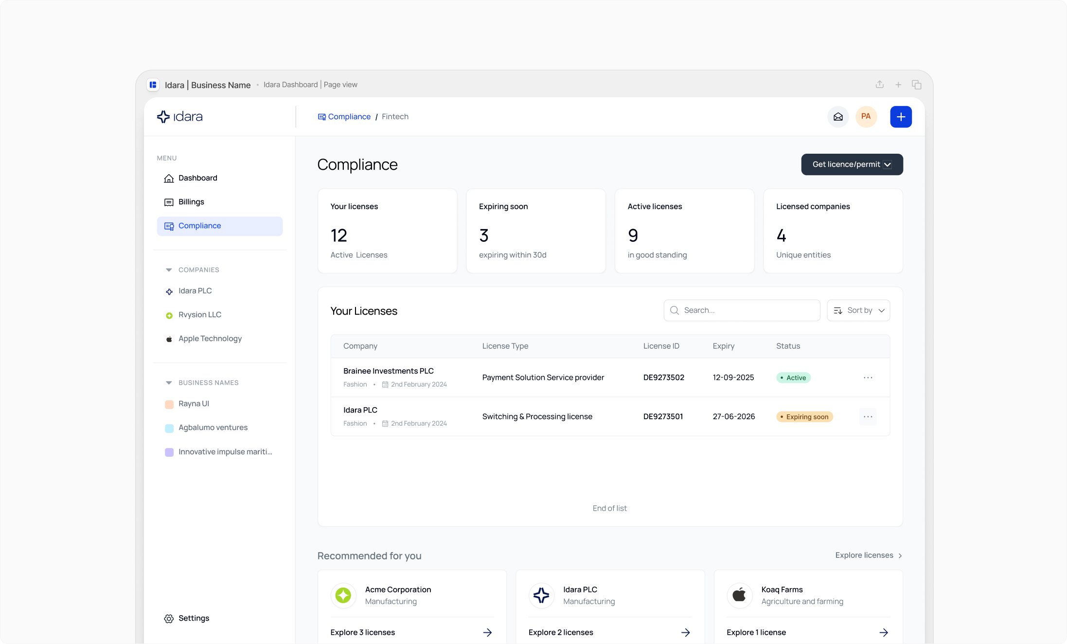
This meant turning isolated screens into connected journeys, from registration to licensing to renewals, and designing the dashboard as a long-term compliance home, not just a landing page.
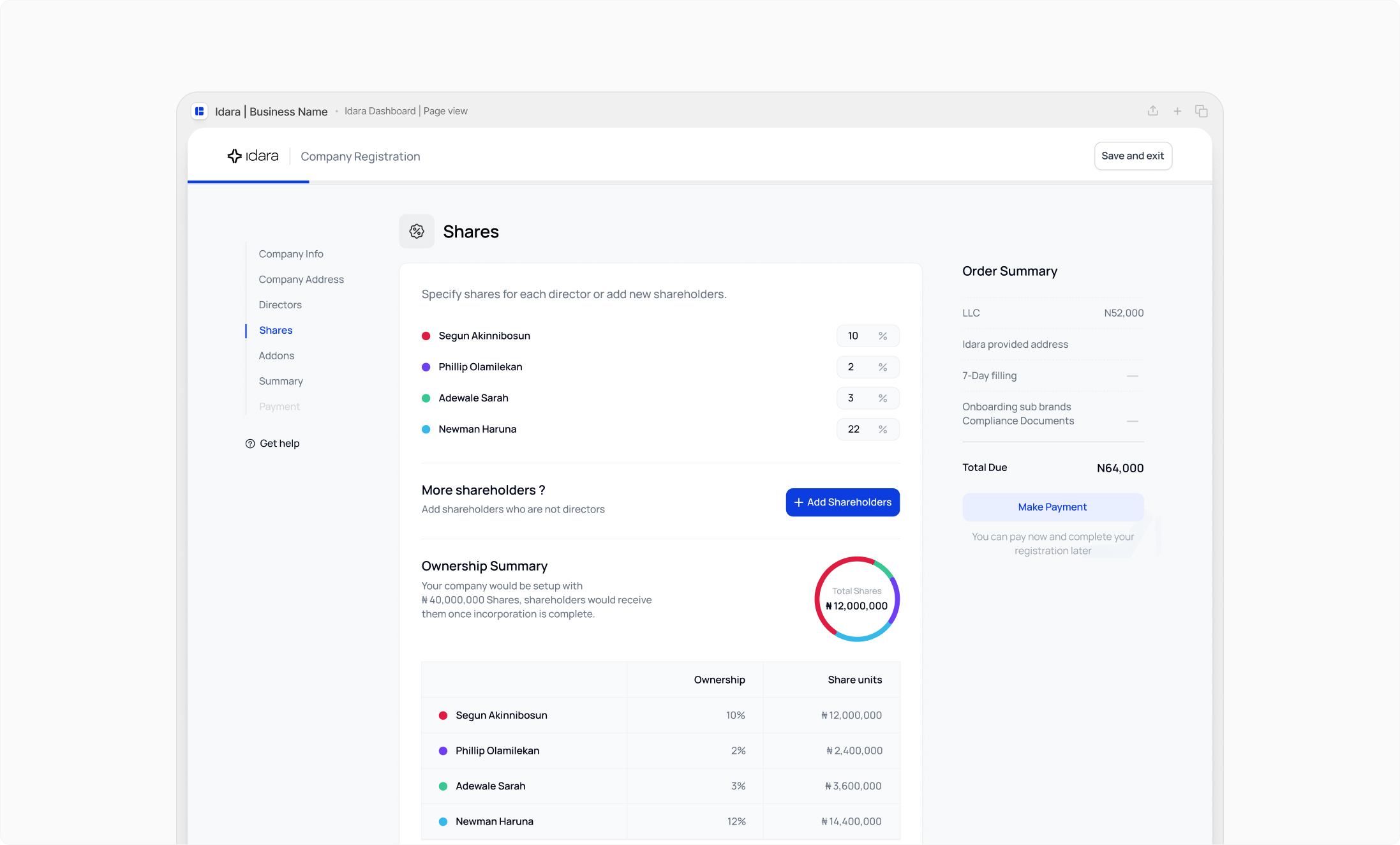
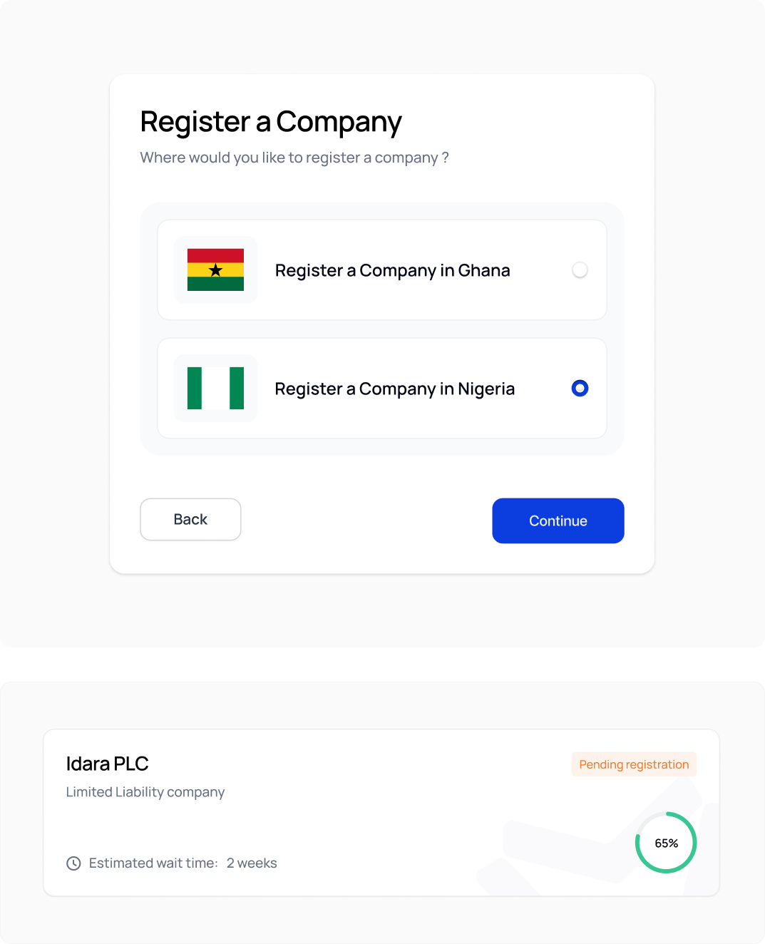
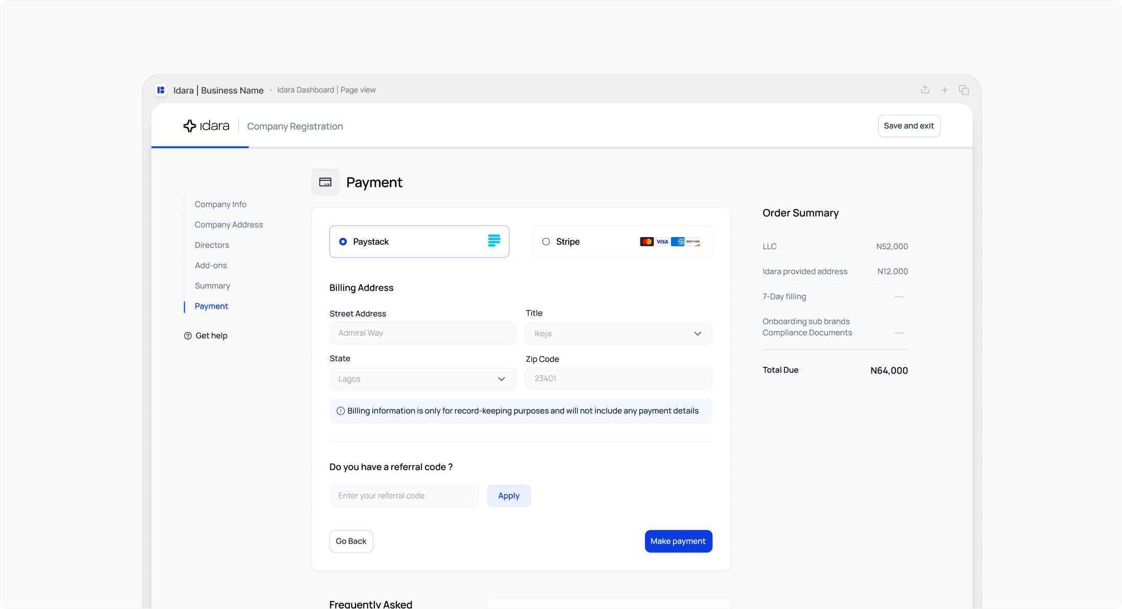
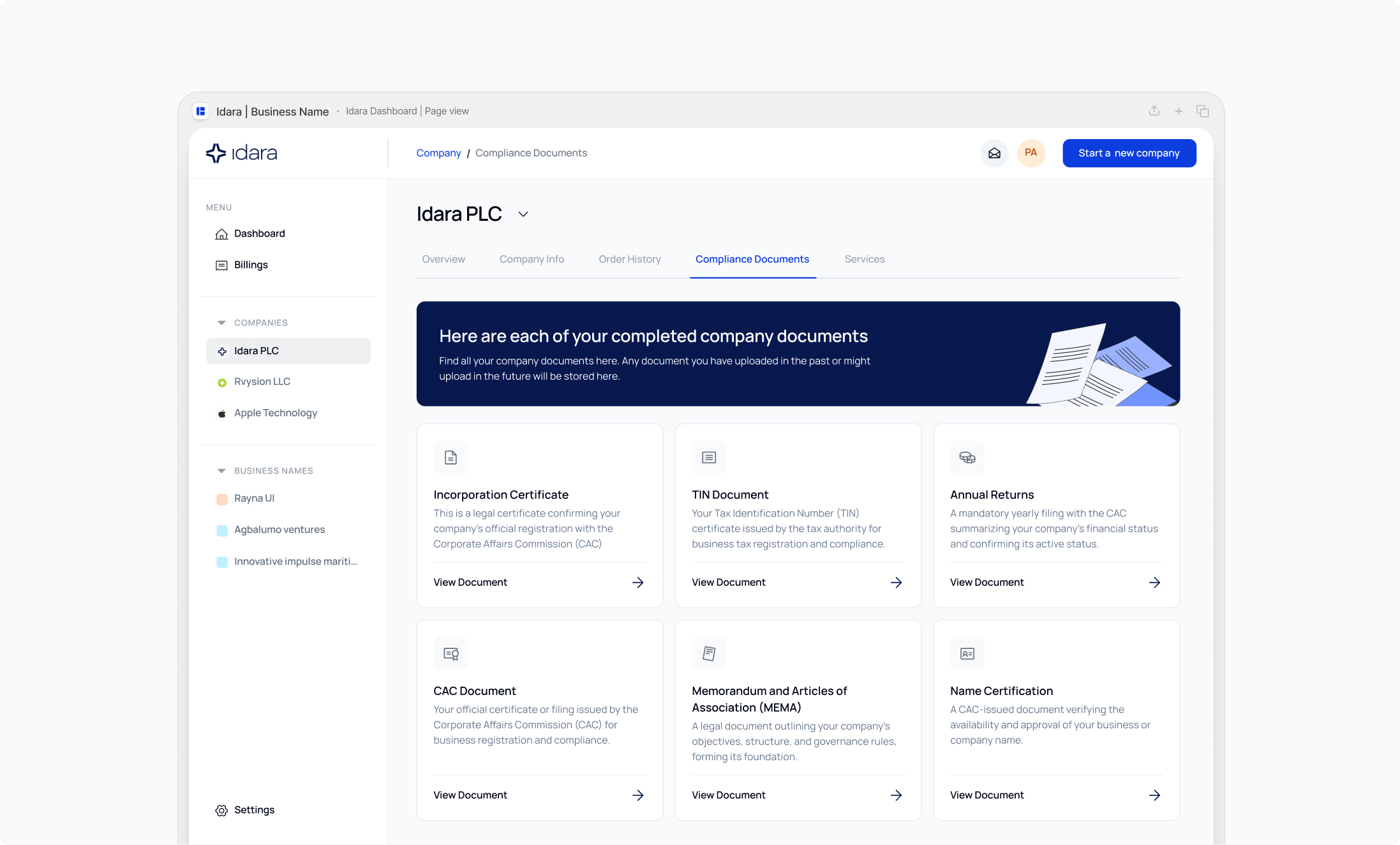
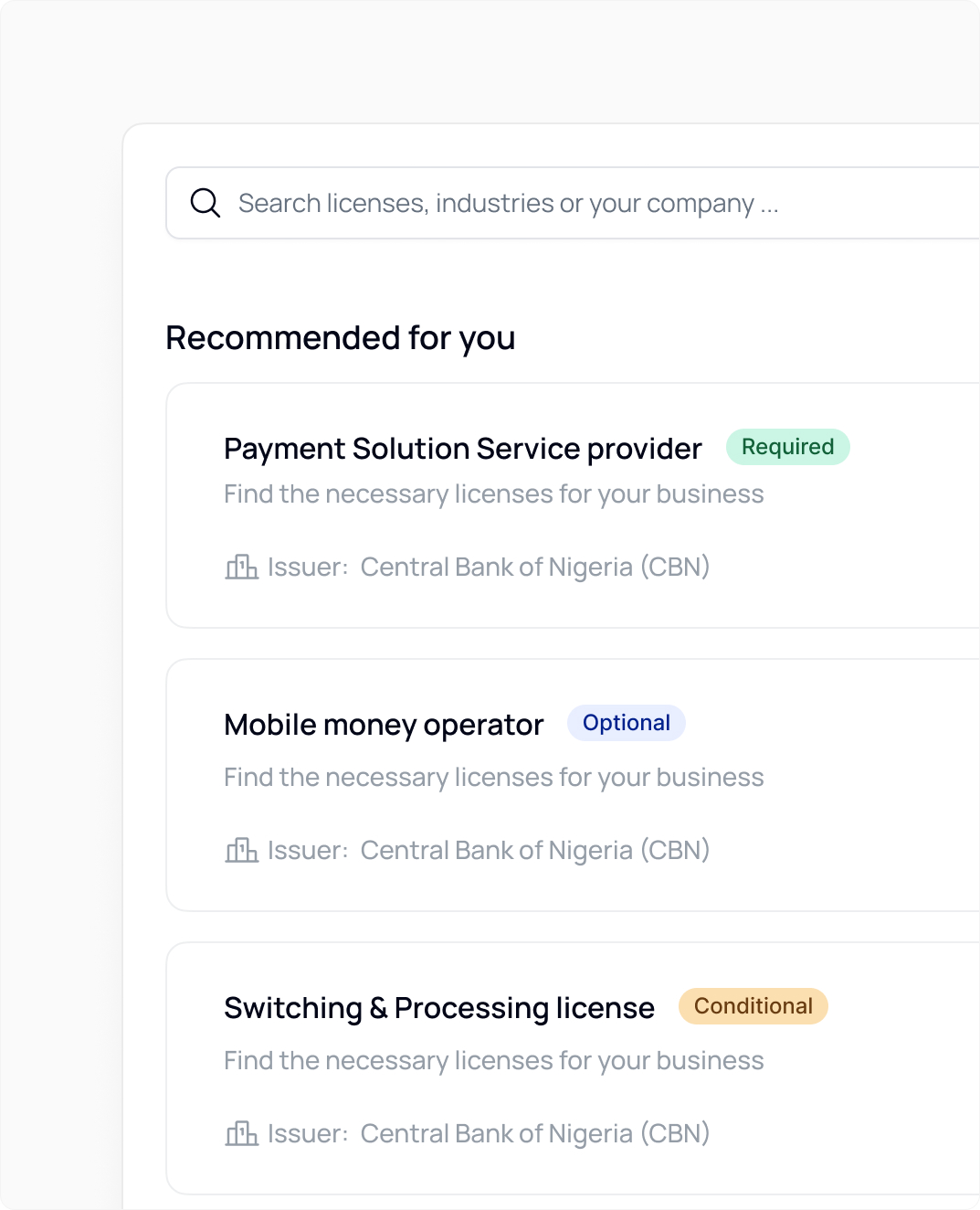
The redesign focused on four core journeys:
#2
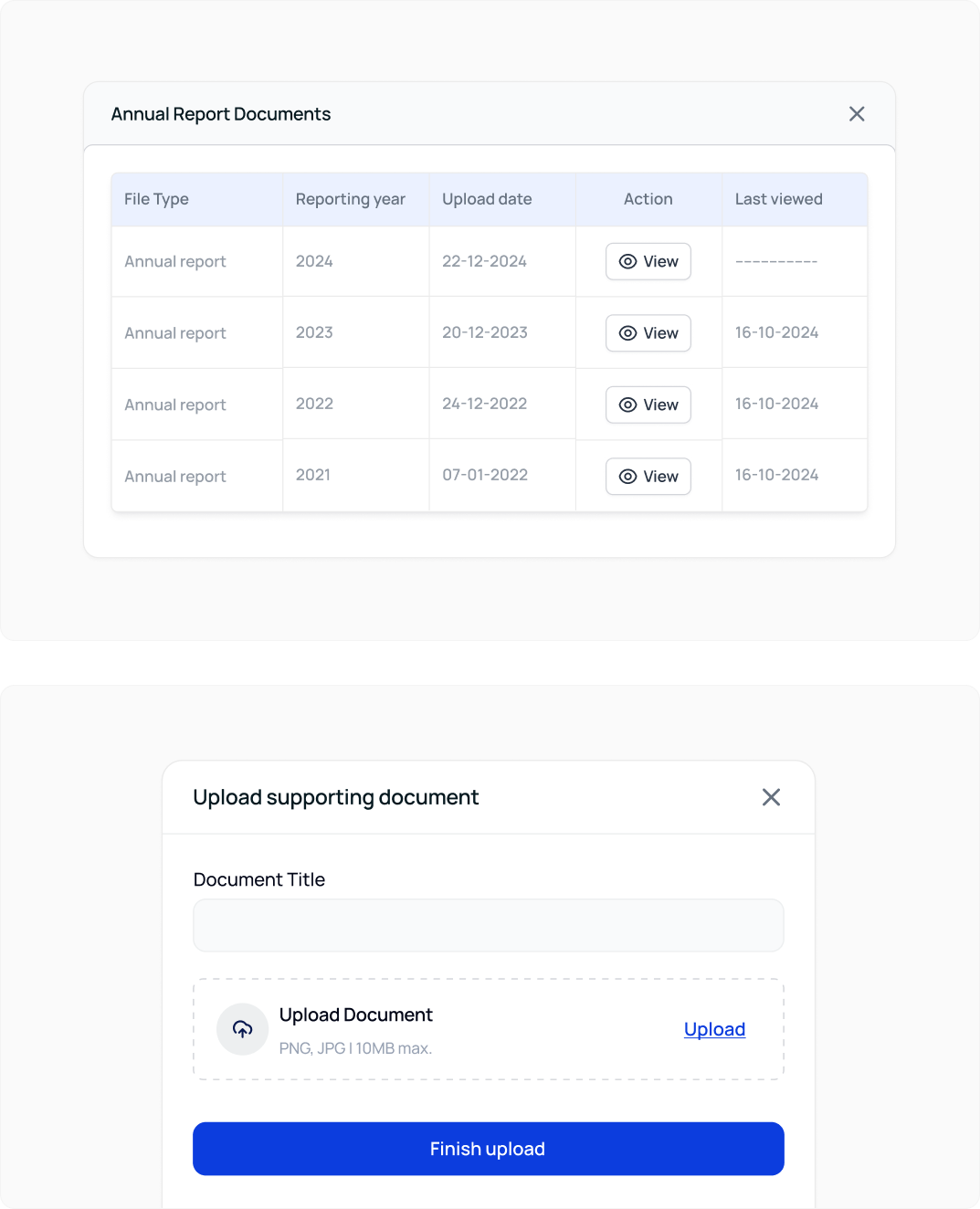
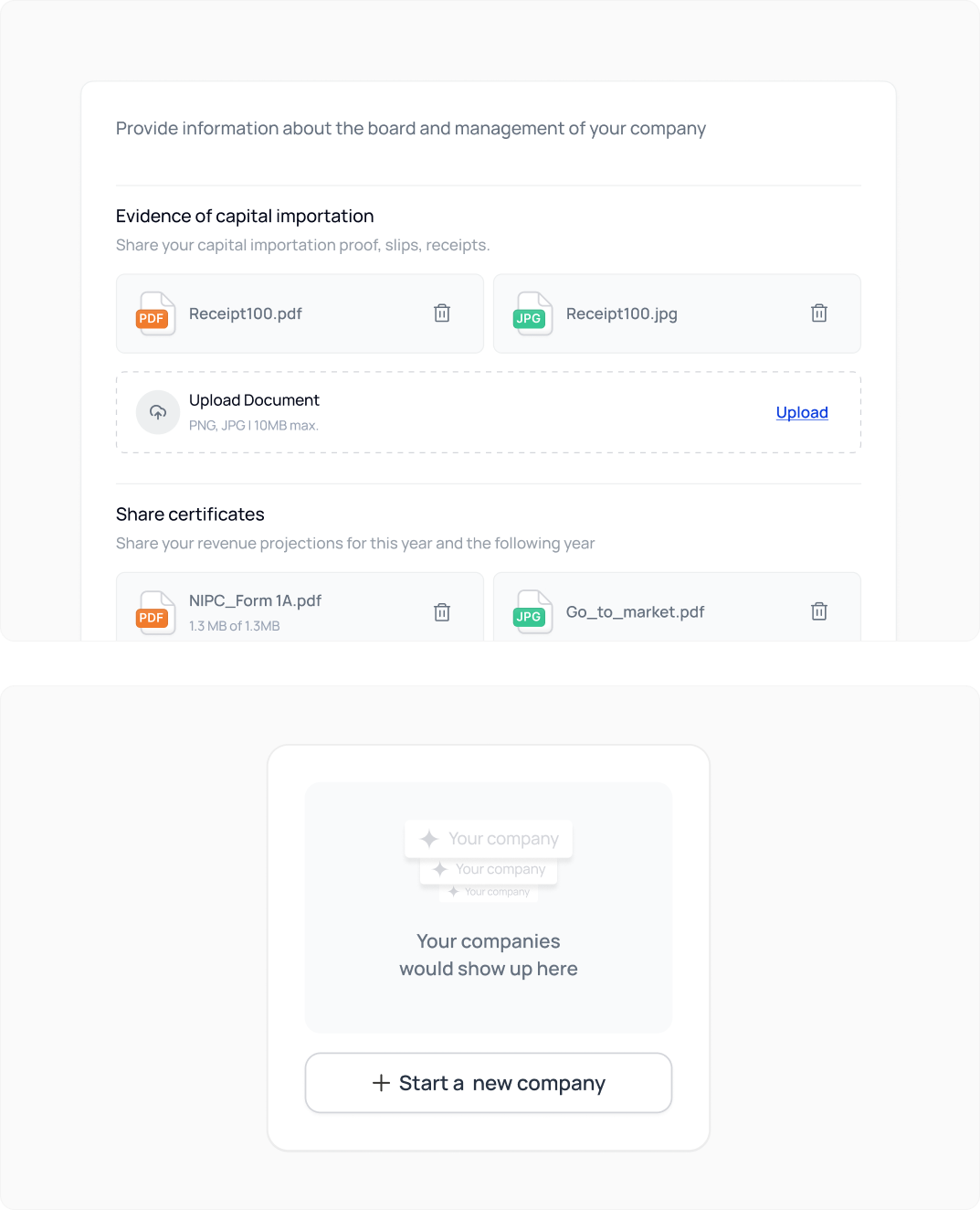
Compliance document management
#4
Payment and submission tracking

.jpg)
.jpg)
.jpg)
.png)
.jpg)
.jpg)
.jpg)
.jpg)