The Product & The Context
Honeycoin is a global payment orchestration platform enabling PSPs, banks, financial institutions, and IMTOs to move money in real time across 45+ markets.
The platform processes over $150M in monthly transaction volume for 350+ enterprise clients.
At this scale, the product is not just a dashboard. It becomes operational infrastructure. Teams rely on it daily to manage balances, execute transactions, and monitor financial activity across currencies and regions.
As Honeycoin grew, the platform became central to how operators did their jobs. What once supported smaller volumes was now expected to perform under real-time, high-stakes financial pressure.
This context is what set the stage for everything that followed.
When the Product Becomes the Bottleneck (The Problem)
As transaction volume increased, the product experience itself started to slow teams down.
Not because payments were complex, but because the interface made critical information harder to interpret
during time-sensitive work.
Operators struggled with:
1. Operators struggled with:
Balances, FX context, and primary actions were spread across multiple zones, forcing operators to scan too much before they could confidently act.
.jpg)
High visual noise made it harder to quickly
understand balances and active operations.
2. Wallets were hard to scan at speed.
Operators managing multiple currencies had to parse dense cards and inconsistent actions, which increased cognitive load during time-sensitive tasks.
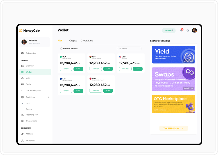
Dense layouts slowed down routine
actions across multiple currencies.
At Honeycoin’s scale, these weren’t just UX inconveniences. They were operational risks.
And with over hundreds of transactions per day, all these frictions compounded into real operational slowdowns and reduced confidence in the system for high-stakes financial workflows.
This was the moment the team realized the platform needed to become a command center, not just a dashboard.
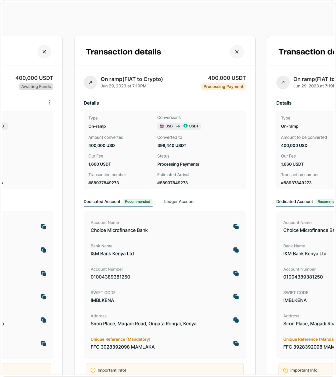
3. Transaction states lacked clarity.
Important status signals were visually muted, making it harder to quickly confirm whether a transaction succeeded, failed, or required follow-up.
.jpg)
Status feedback wasn’t designed for high-
pressure operational use.
Why This Was Hard (The Constraints)
This redesign wasn’t happening in a vacuum.
We were working inside a live financial system handling real money, with enterprise clients relying on it daily. There was no room for breaking changes. We had to factor in regulatory constraints, compliance requirements, and deep engineering dependencies because all these shaped what could ship and how quickly.
Live System (Active Users)
Had to consider:
Some flows were constrained by existing APIs
Certain “ideal UX” solutions would have required major backend rewrites (not feasible in 6 months)
Some flows must remain explicit, verbose, or multi-step for legal reasons
These constraints forced disciplined tradeoffs. The goal wasn’t to create the cleanest interface in theory, but the most usable interface that could safely operate in a real financial system.
The Design Strategy
Instead of starting with UI, I started with the workflows and UX journey.
I mapped how operators actually moved money, where they hesitated, where they left the product to get clarity, and where small friction compounded into slowdowns.
This reframed the redesign around 4 principles:
Principle #1
The dashboard should behave like an operational surface
Principle #2
High-frequency actions should be fast and predictable
Principle #3
Critical information should be scannable in seconds
Principle #4
Standardize components to reduce cognitive load and user error
These decisions followed workflow reality, not visual trends.
As this was not a visual refresh. The goal was to redesign the product around how enterprise teams actually operate day to day under pressure.
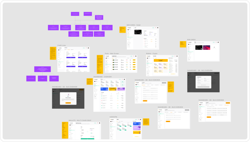
.jpg)
Mapping out Multi-regional workflows
.jpg)
Mapping out Multi-regional workflows
The Decisions That Changed the Experience (The Solution)
Once the friction points and principles to guide the designs were clear, I focused on a few high-impact decisions rather than trying to redesign everything at once.
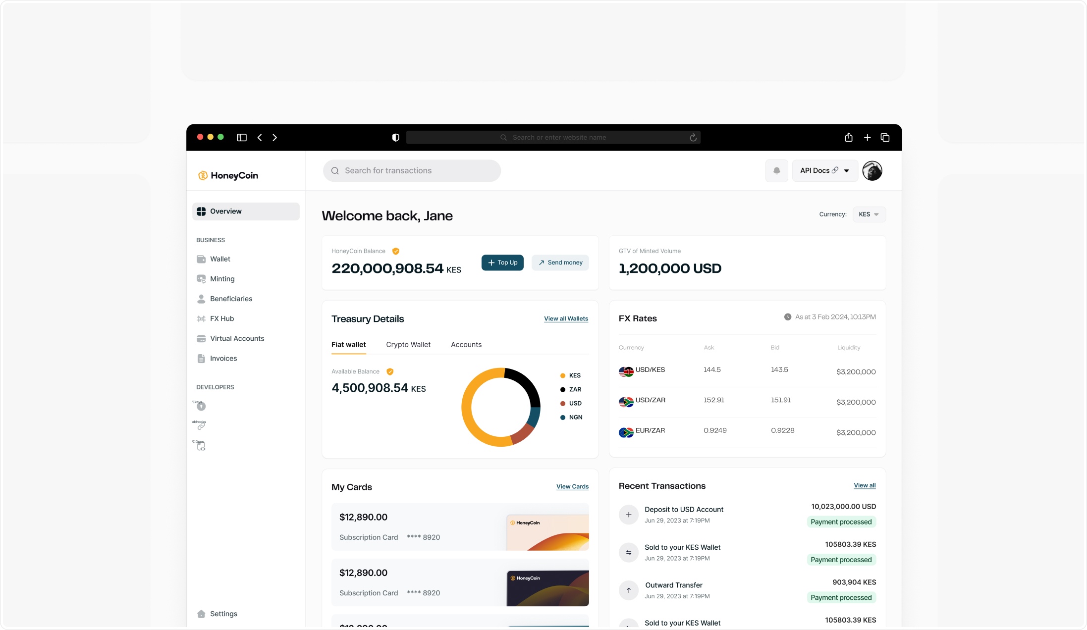
Key Design Decision - #1
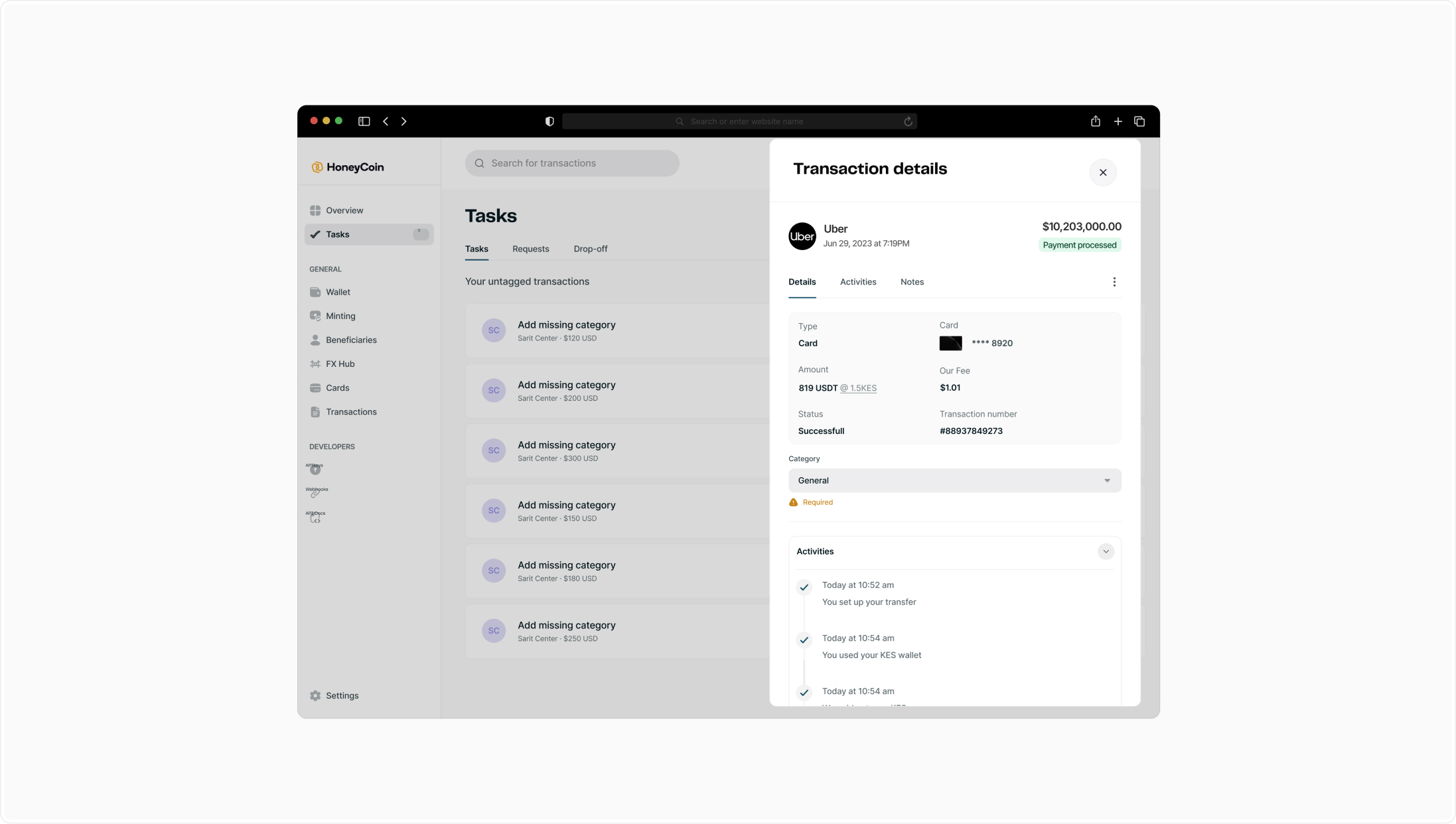
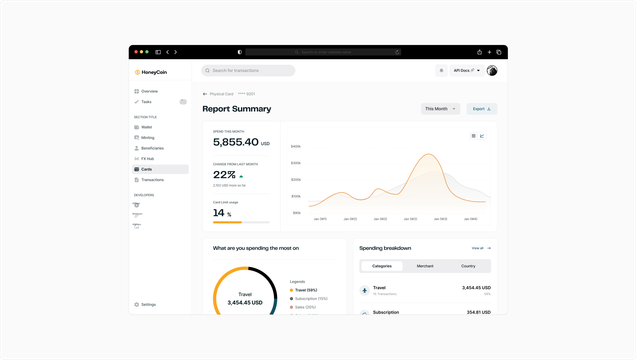
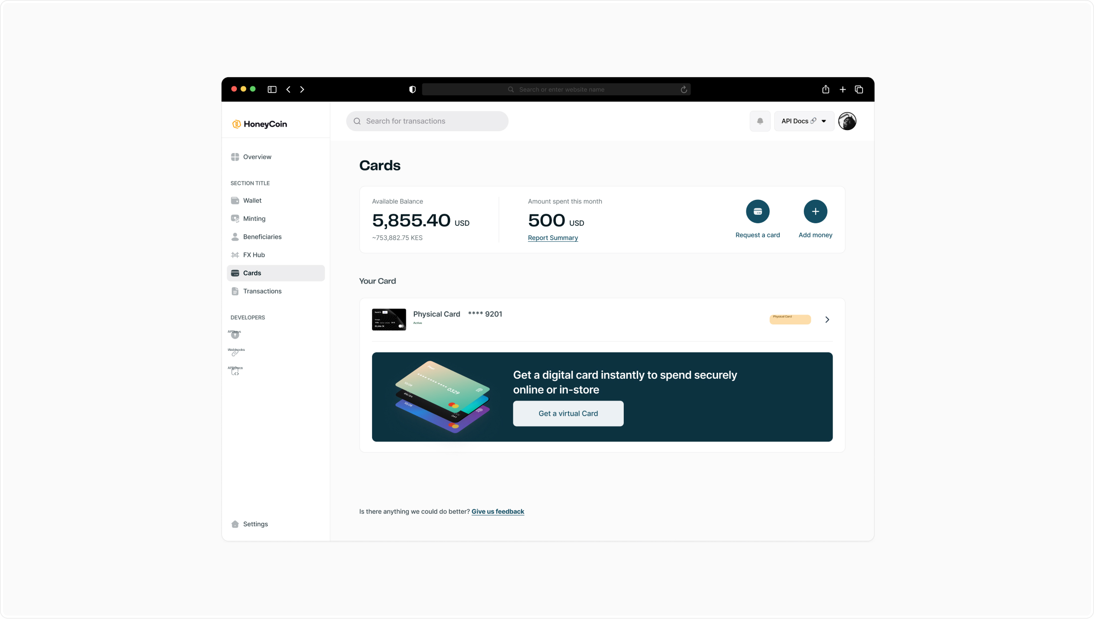
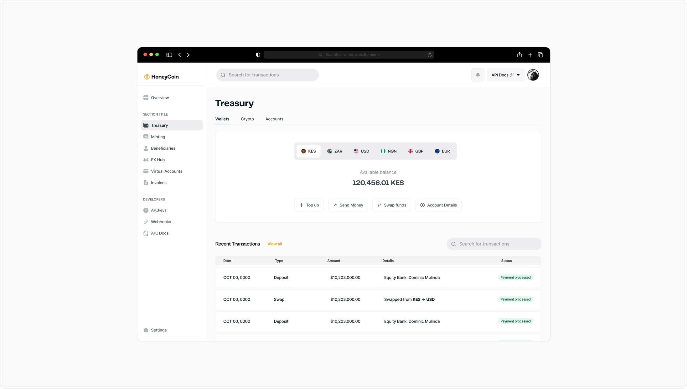
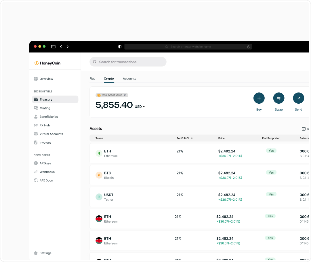
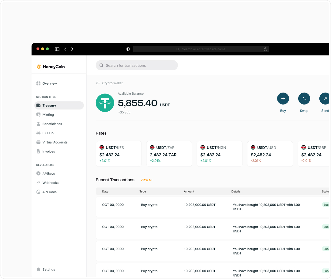
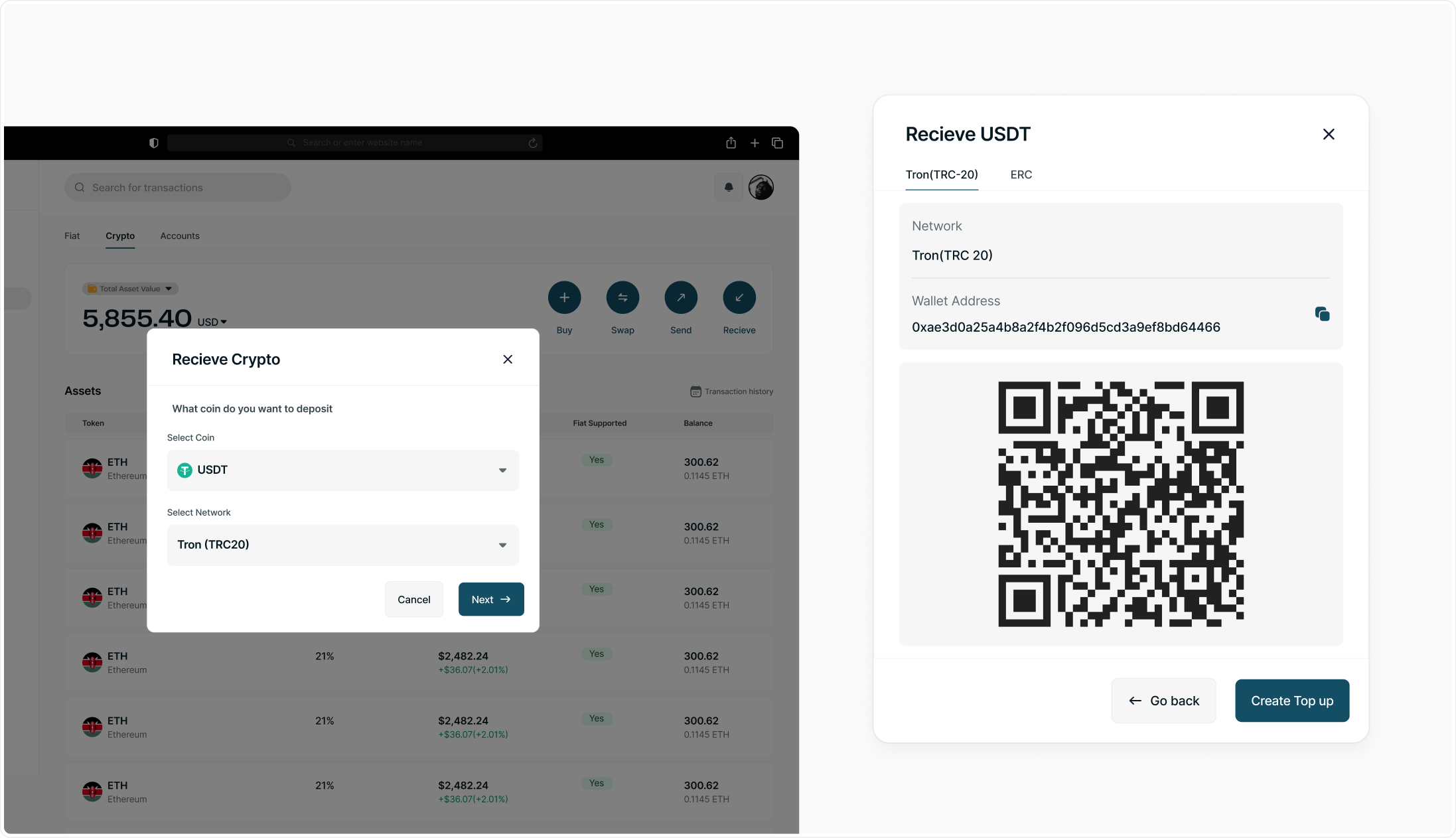
Turn the dashboard into a command center
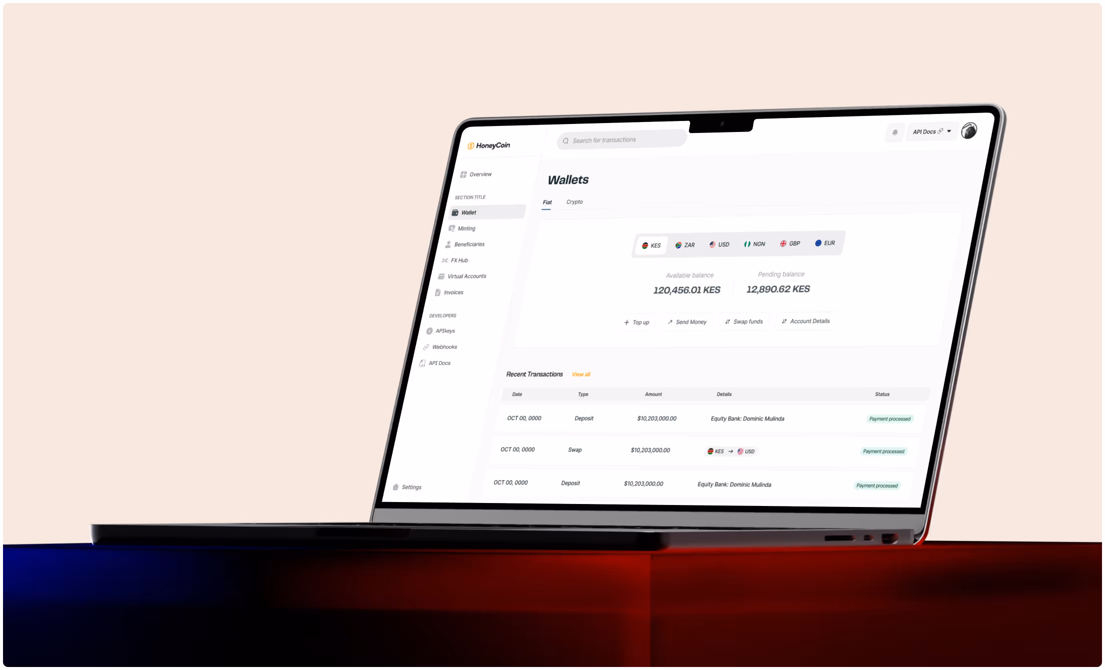
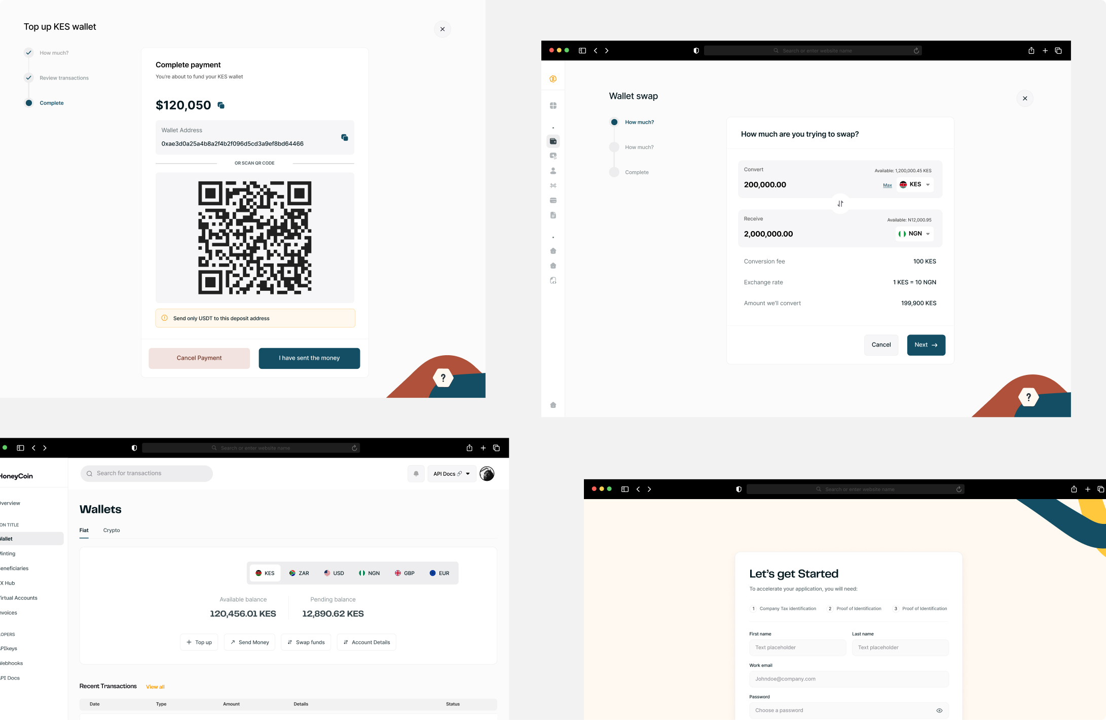
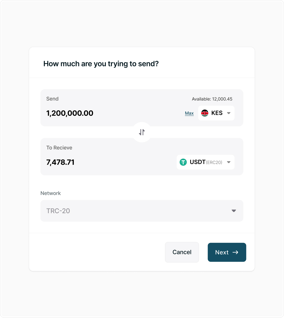
First, I turned the dashboard into a command center. Instead of spreading critical information across multiple pages, balances, FX rates, liquidity, and recent transactions were surfaced in one place. This allowed operators to understand their financial position at a glance.

.jpg)

.jpg)
.png)
.jpg)
.jpg)
.jpg)
.jpg)
.png)
.png)