The Context
Marketing automation platforms are inherently complex products. They combine multiple systems into a single interface: customer databases, segmentation tools, campaign builders, automation workflows, analytics dashboards, and integration management.
In Engage’s case, the platform had grown feature-by-feature over time. While each capability worked individually, the overall experience lacked cohesion. New users often felt overwhelmed when navigating the product for the first time, and experienced users had to spend unnecessary time searching for common actions.
This friction showed up most clearly in everyday workflows such as creating campaigns, managing customer lists, and building automation sequences.
The redesign effort focused on rethinking the structure of the platform so that core workflows could feel faster, clearer, and easier to understand.
My Role End-to-End
I led the design of the Engage B2B dashboard experience, working closely with the Product Manager and engineering team to rethink the platform’s core interaction patterns.
My responsibilities included defining the product interface structure, designing the dashboard and campaign workflows, and shaping the visual direction of the product experience.
Because the platform already existed and was actively evolving, the work involved balancing improvements to usability with the need to maintain compatibility with the existing product architecture.
Working Within Constraints
One of the defining aspects of this project was the environment in which it was built.
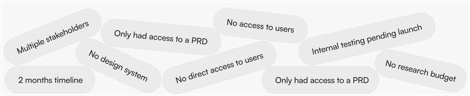
The redesign had to move quickly. The timeline for the project was approximately two months, and the team did not have access to direct user research during that period.
Instead of conducting traditional user interviews or usability tests, the primary source of product insight came from the product requirements document (PRD), internal team testing & feedback, plus analysis of competing tools in the marketing automation space.
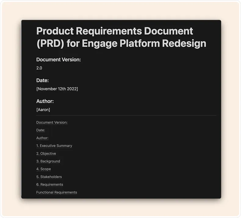
PRD - Prepared by Aaaron the PM
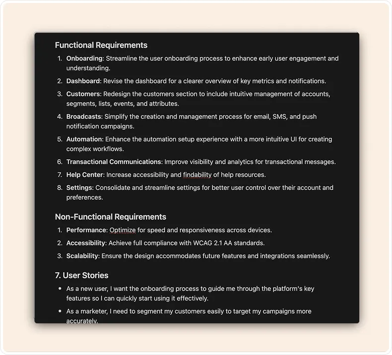
PRD - Prepared by Aaaron the PM
.webp)
Market/Competitors Analysis - led by Aaron (PM) & Collins (me)
.webp)
Internal testing rounds - led by Aaron (PM) & Collins (me)
The project also began without an existing design system. This meant that part of the design work involved establishing consistent patterns and visual structure across the product while redesigning the interface itself.
Rather than viewing these constraints as limitations, the team treated them as a design challenge. The goal became interpreting the PRD as a proxy for user needs while grounding design decisions in common behavioral patterns seen across successful SaaS platforms.
Framing the Core Problem
After reviewing the existing product and the PRD, three issues consistently surfaced.
The existing platform contained powerful features but presented them in dense layouts
that made it difficult for users to quickly understand where key actions lived.
1. Usability
First, navigation through the platform felt unnecessarily complicated. Users often struggled to locate core product areas such as campaign creation, automation workflows, and customer segmentation.
2. Cluttered
Second, the interface itself felt visually cluttered. Important functionality existed, but it was often buried inside dense layouts and poorly organized menus.
3. Outdated
Finally, the visual language of the product had not kept up with the expectations of modern SaaS tools. Users described the interface as outdated and difficult to scan quickly.
Individually, these issues were manageable. Together, they created an experience where users had to invest extra effort simply to understand where to begin.
The redesign therefore focused on simplifying the product’s structure while preserving the power of the underlying system.
Translating Problems into Design Direction
Instead of treating the redesign as a visual refresh, the work began by reframing each of the core problems into an opportunity.
1. Unusable → Ease of Use
Where the interface previously required users to search for actions, the new design emphasized clearer access to the platform’s most common workflows.
2. Cluttered → Relevant
Where the product previously felt cluttered, the redesign focused on improving visual hierarchy so that important information could be understood at a glance.
3. Outdated → Modern
And where the interface previously felt outdated, the goal became creating a design language that felt modern while remaining familiar enough for existing users to adopt quickly.
This shift in thinking helped guide the direction of the design work and ensured that aesthetic improvements were always tied to functional clarity.
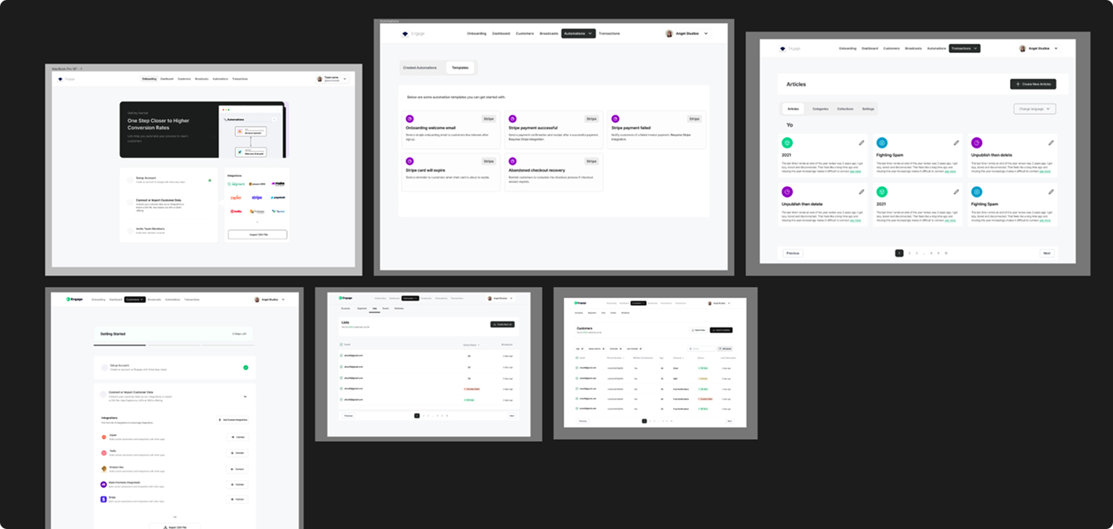
Exploring the Design Direction
The design process began with a period of rapid exploration. Without direct user access, competitor research became particularly valuable. Examining how other marketing automation platforms structured their interfaces helped identify patterns that users were likely already familiar with.
Initial design explorations prioritized spacious layouts, larger UI elements, and simplified navigation structures. These early prototypes helped test whether reducing visual density would make the product easier to scan and understand.
❌ Iteration V1: Relaxed, spacious, larger elements
V1 Explorations - Didn’t make the cut
One of the early iterations leaned heavily toward visual minimalism. While the interface looked cleaner, internal testing revealed that certain advanced capabilities became harder to access.
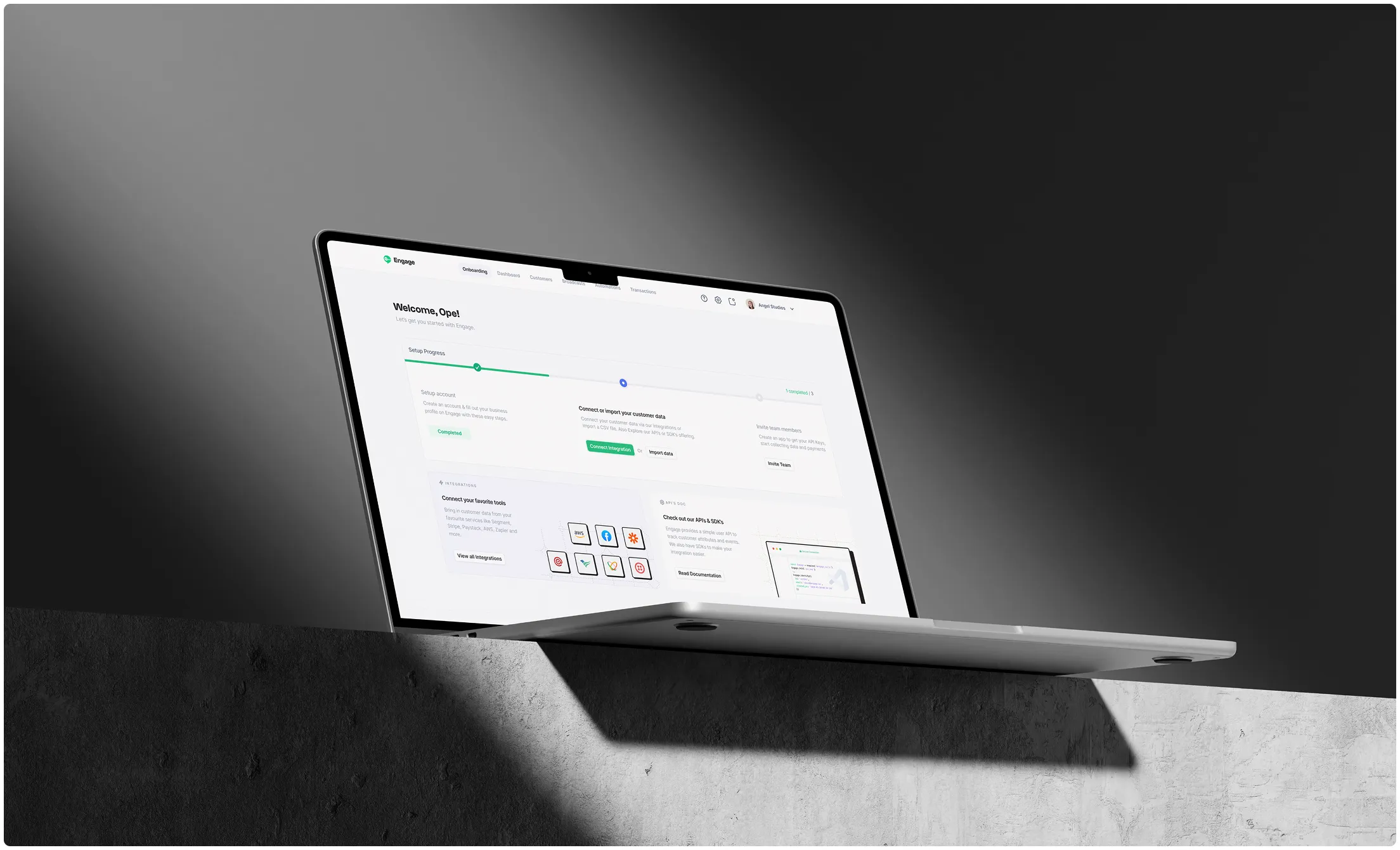
✅ Iteration V2: Simple, modern, clean and familiar patterned design
.jpg)
V2 Explorations - Made the cut
The next iteration focused on finding a better balance between simplicity and depth. The final direction preserved the platform’s advanced capabilities while making them easier to discover through clearer hierarchy and improved layout patterns.
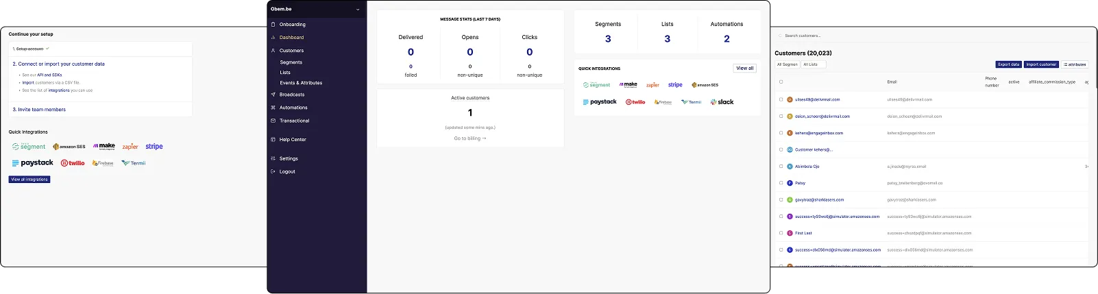
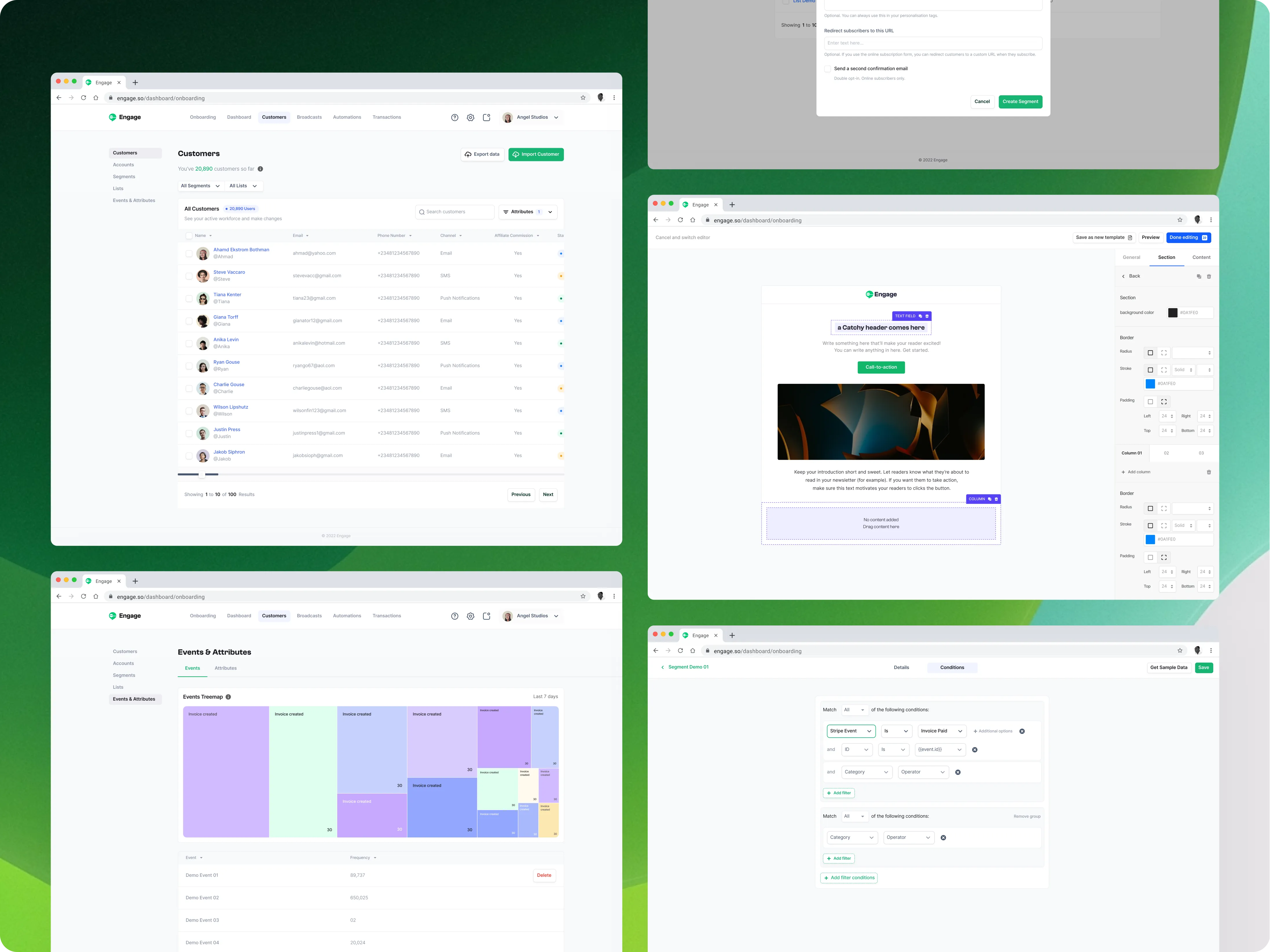
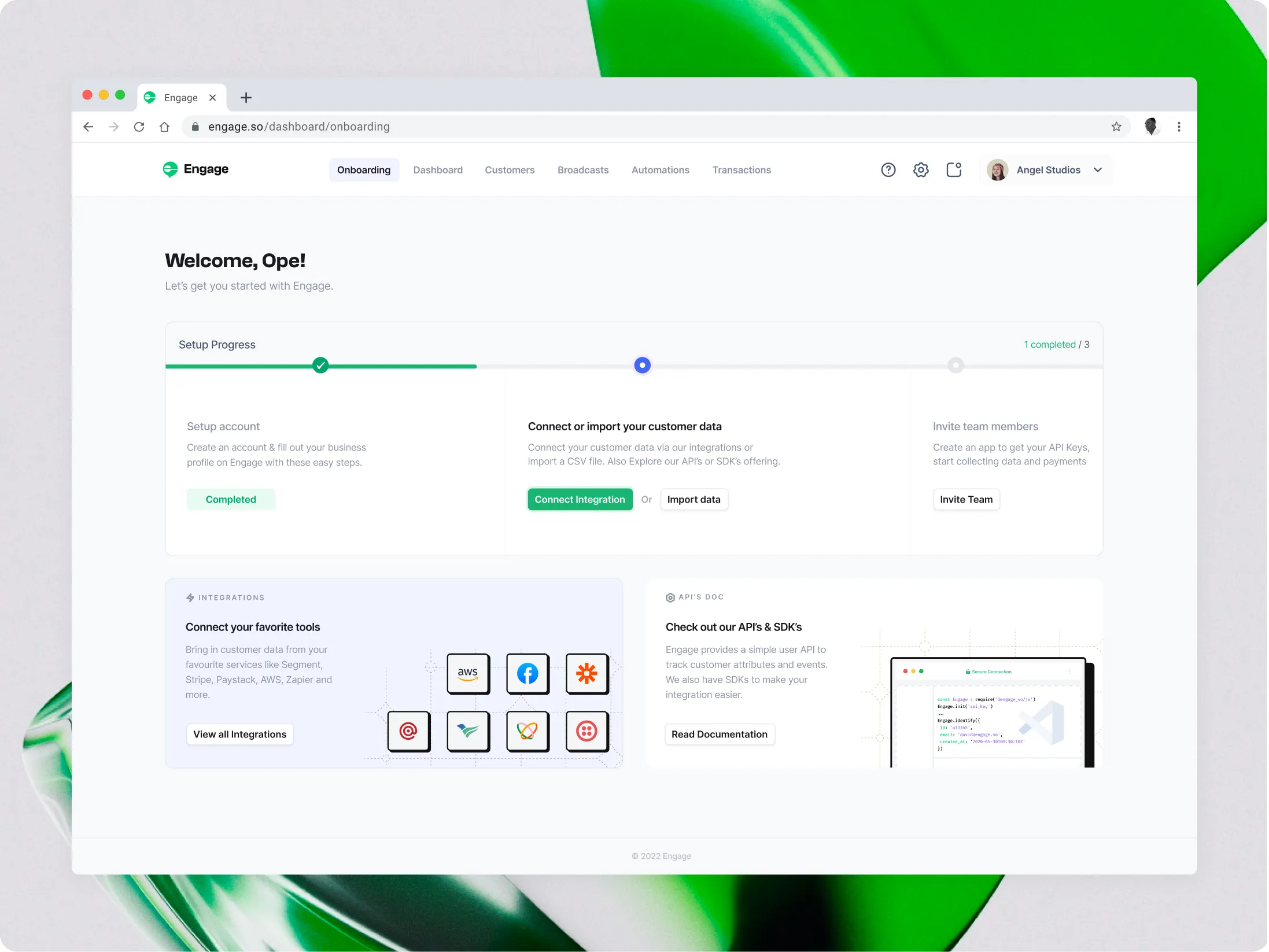
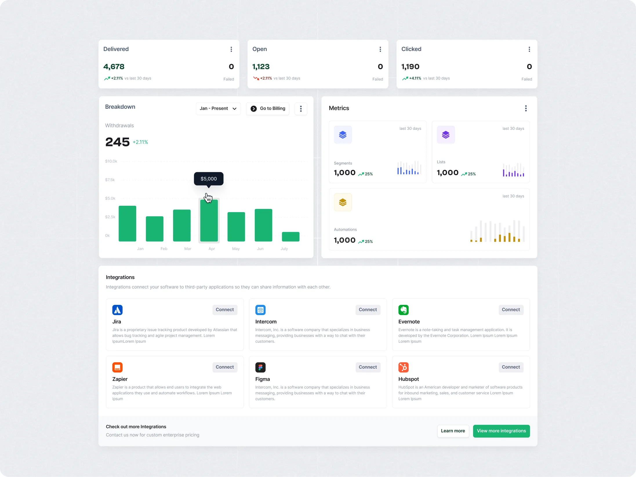
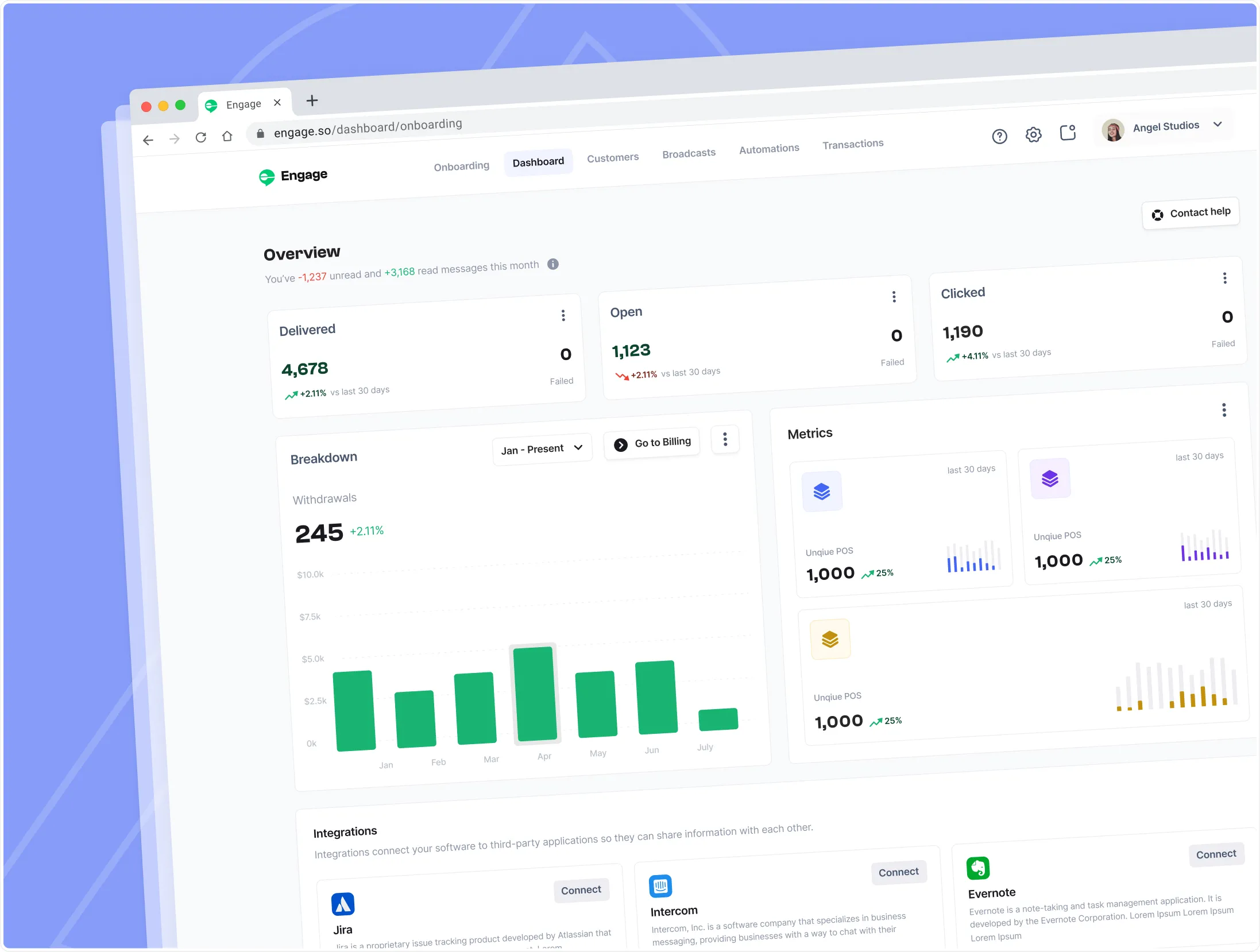
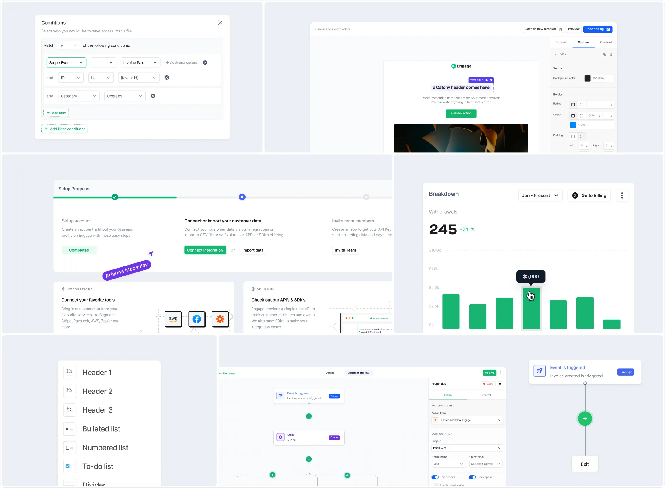
Reimagining the Platform Experience
The redesign touched several key areas of the product experience.
The redesign focused on four core journeys:
#3
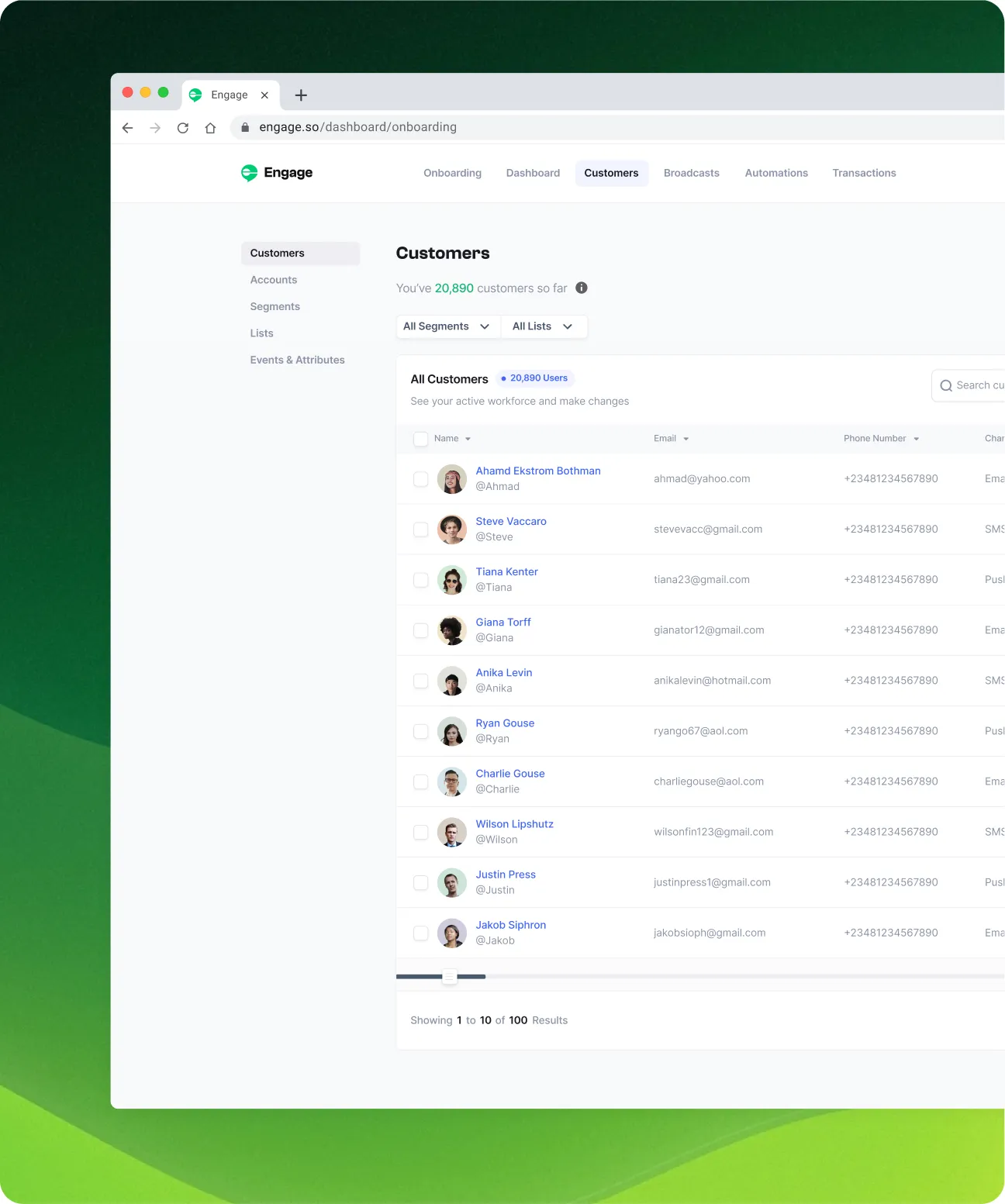
The Customer Management Flow
#4
The Broadcast Workflows
#5
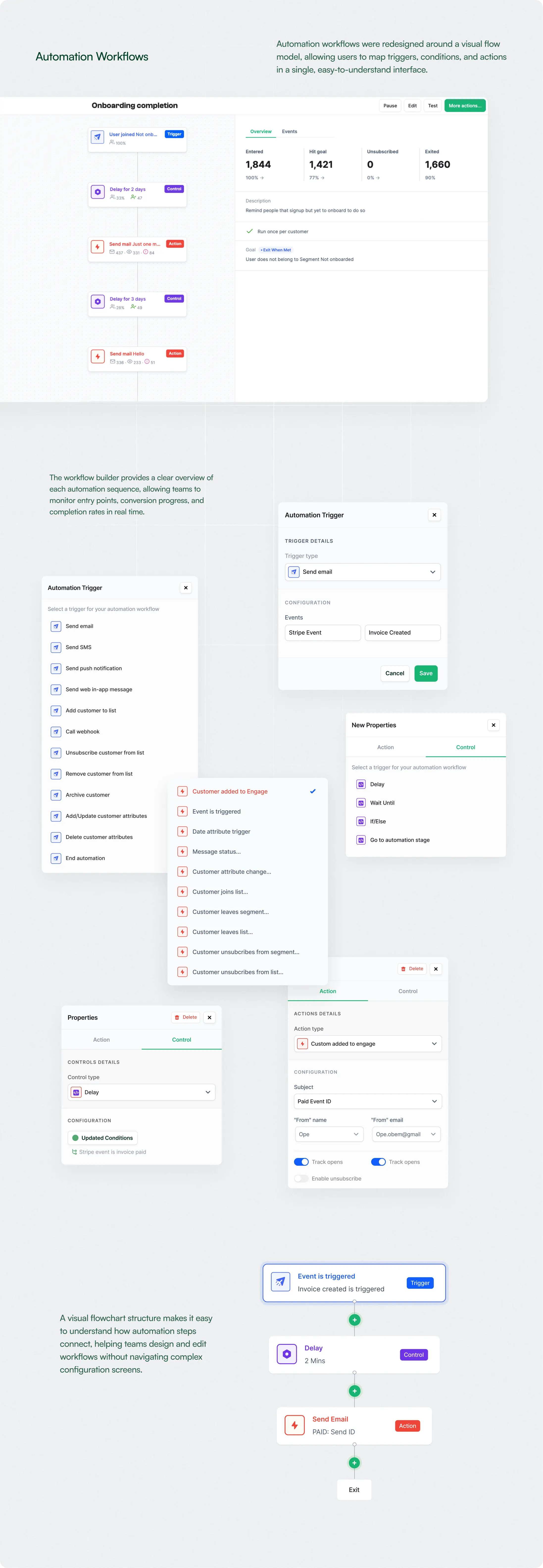
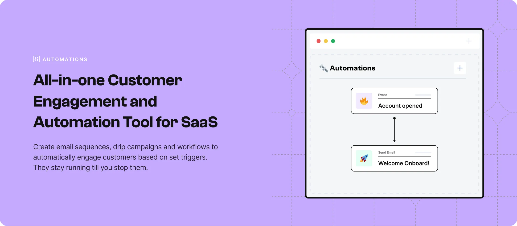
The Automation Workflows
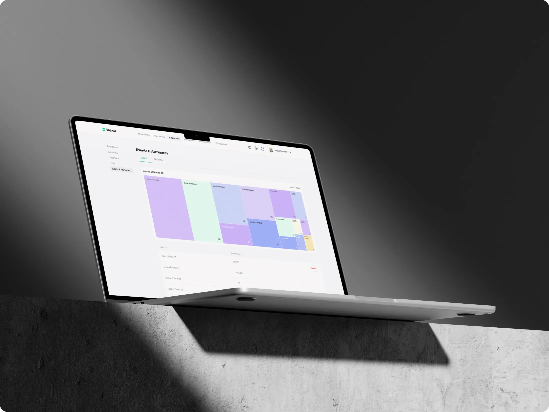
Together, these improvements helped the platform feel less like a collection of disconnected tools and more like a cohesive system.


.webp)
.webp)
.webp)


.jpg)